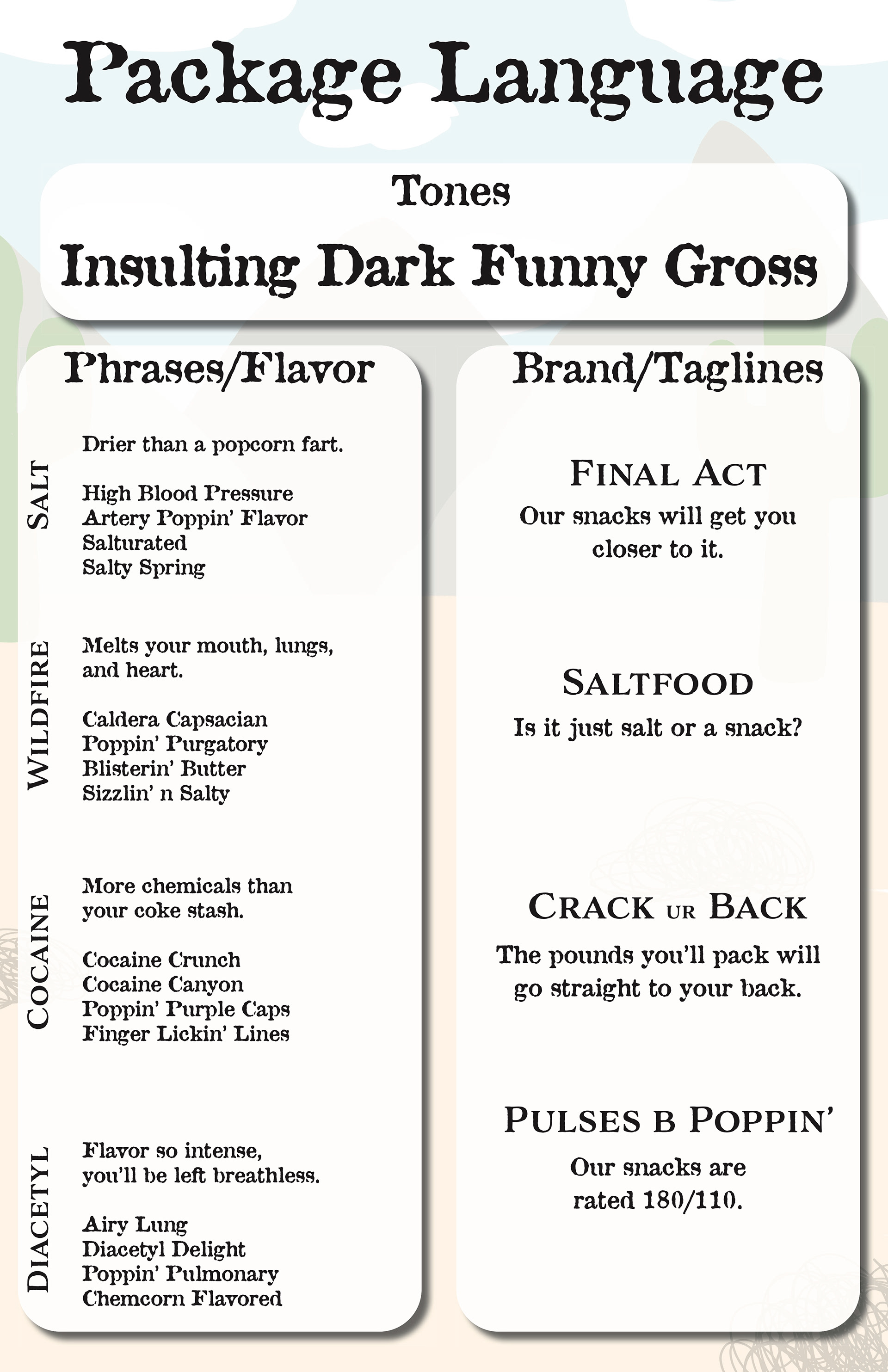
Package language I
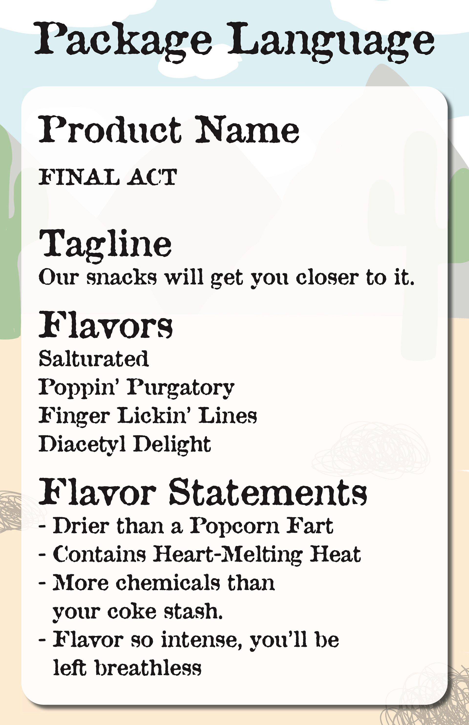
Package language II
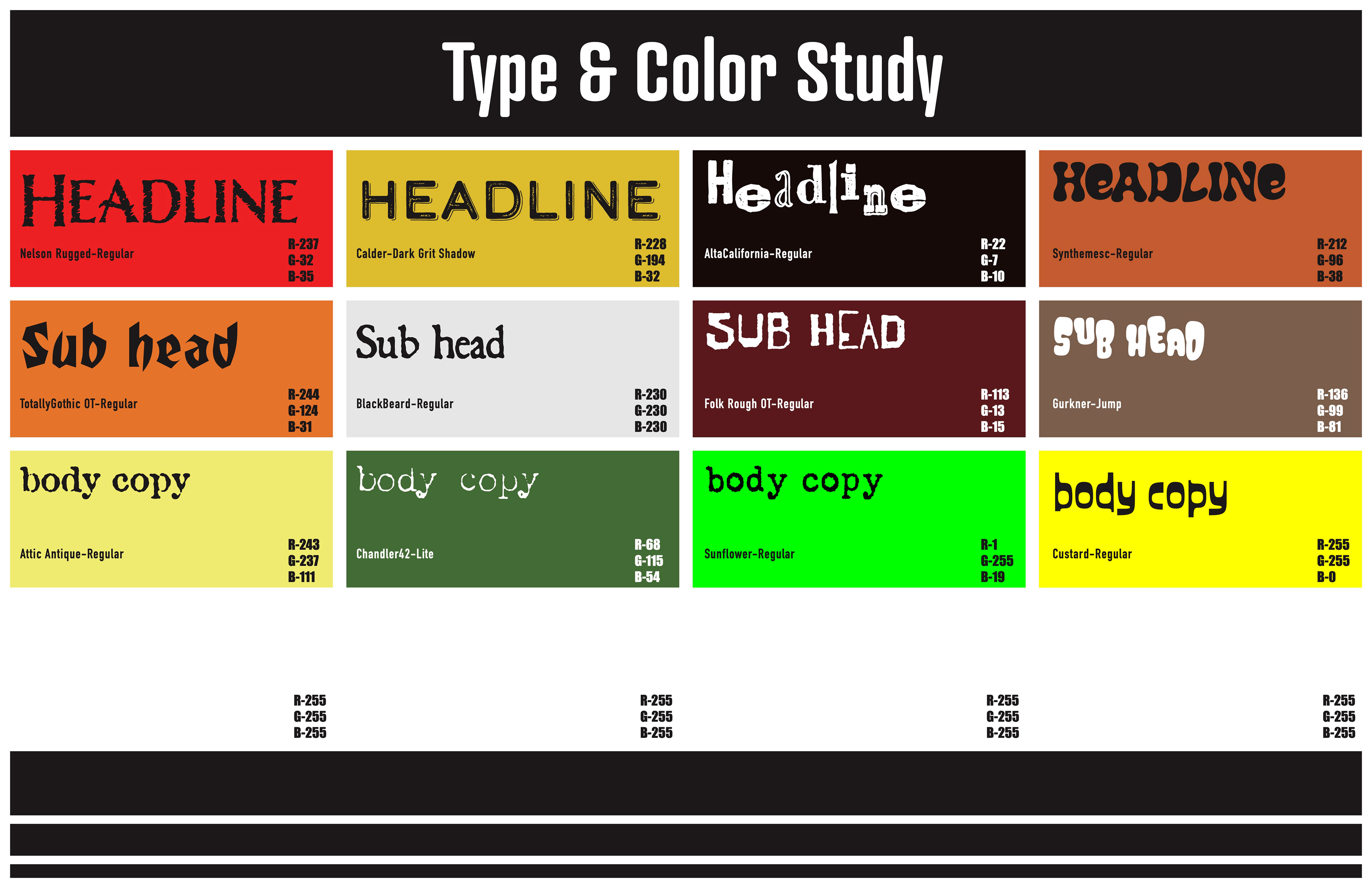
Type and color study
Language
Finding the language for the brand was an interesting obstacle compared to researching the region this popcorn would be based in. To help narrow it down,
I took the worst parts about my region, and used them as a base for my taglines. Said characteristics revolved around salt, wildfires, cocaine, and diacetyl (a chemical in popcorn bags that can give you popcorn lung).
I took the worst parts about my region, and used them as a base for my taglines. Said characteristics revolved around salt, wildfires, cocaine, and diacetyl (a chemical in popcorn bags that can give you popcorn lung).
Fonts
For color and fonts, I wanted something grimy for each popcorn flavor. I kept the fire flavor (Poppin' Purgatory) relatively normal, but I wanted to experiment with the other flavors. While some colors were modified and scrapped during the design phase, the fonts were used more consistently.
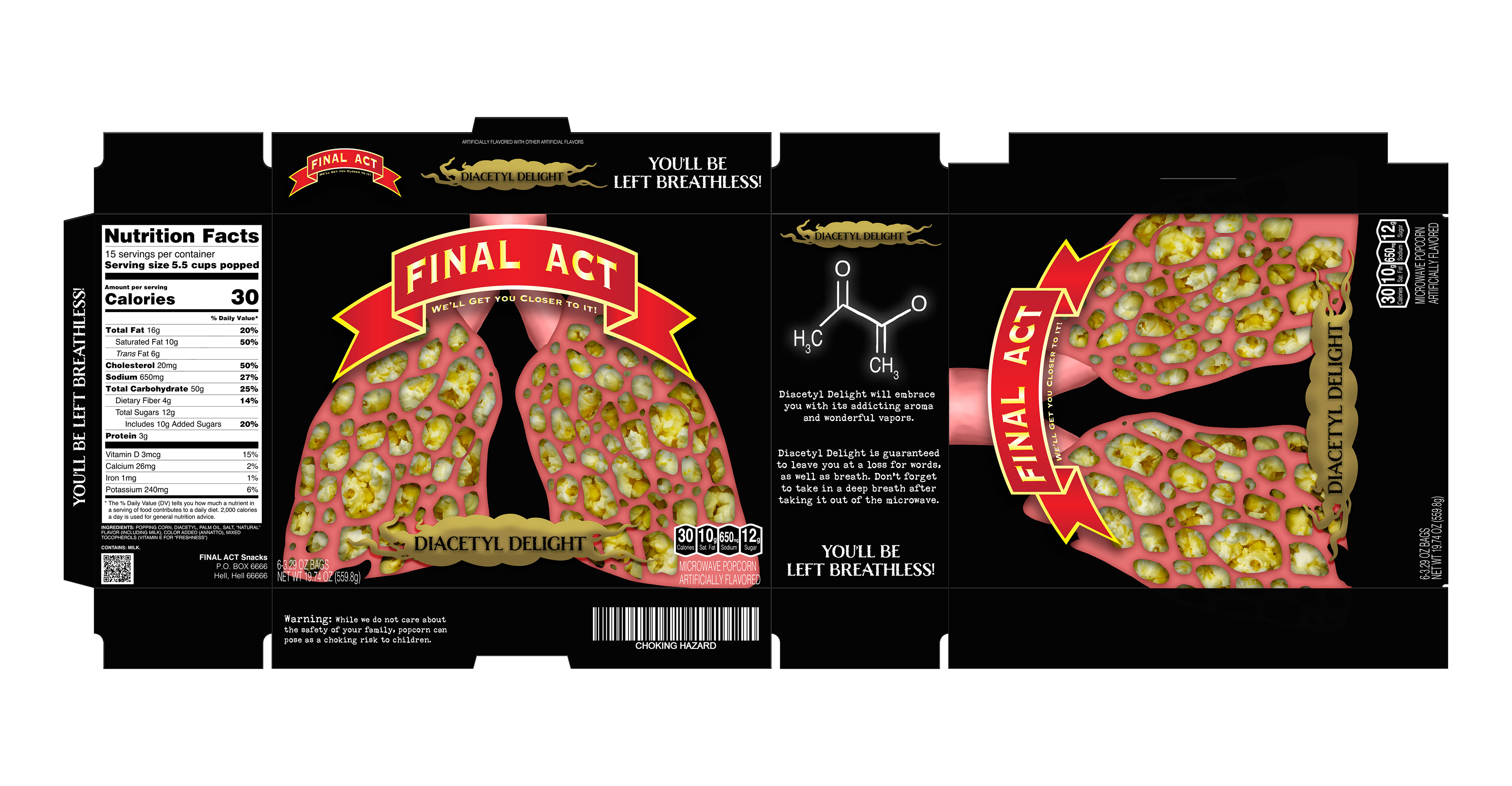
Diacetyl Delight. This flavor is based off of the health threat popcorn bags posed to consumers if too much of the vapors were inhaled. If too much diacetyl is inhaled, consumers risked getting Bronchiolitis obliterans (Popcorn lung). It damages the bronchioles of your lungs, leaving them inflamed and scarred.
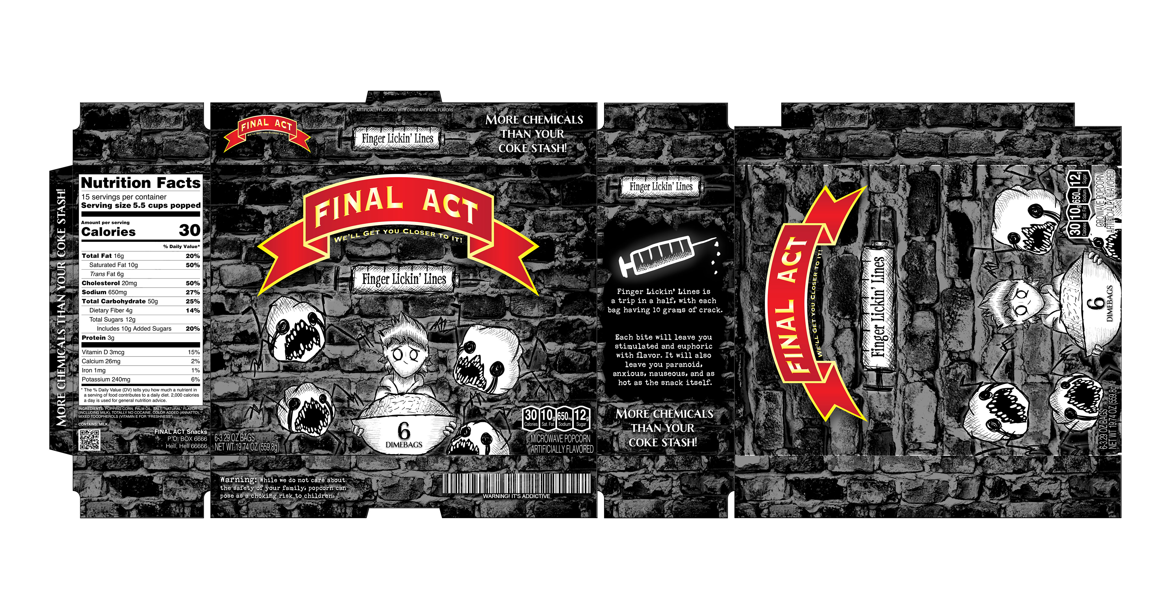
Finger Lickin' Lines is a jab at Las Vegas and the drugs that run through the Sin City. While researching the effects of cocaine, anxiety and hallucinations were ones that stood out the most to me. I used a grungy background to reference the side of a building or alley way, and used a scratchy/crosshatch-y art style to mimic the effects of cocoaine.
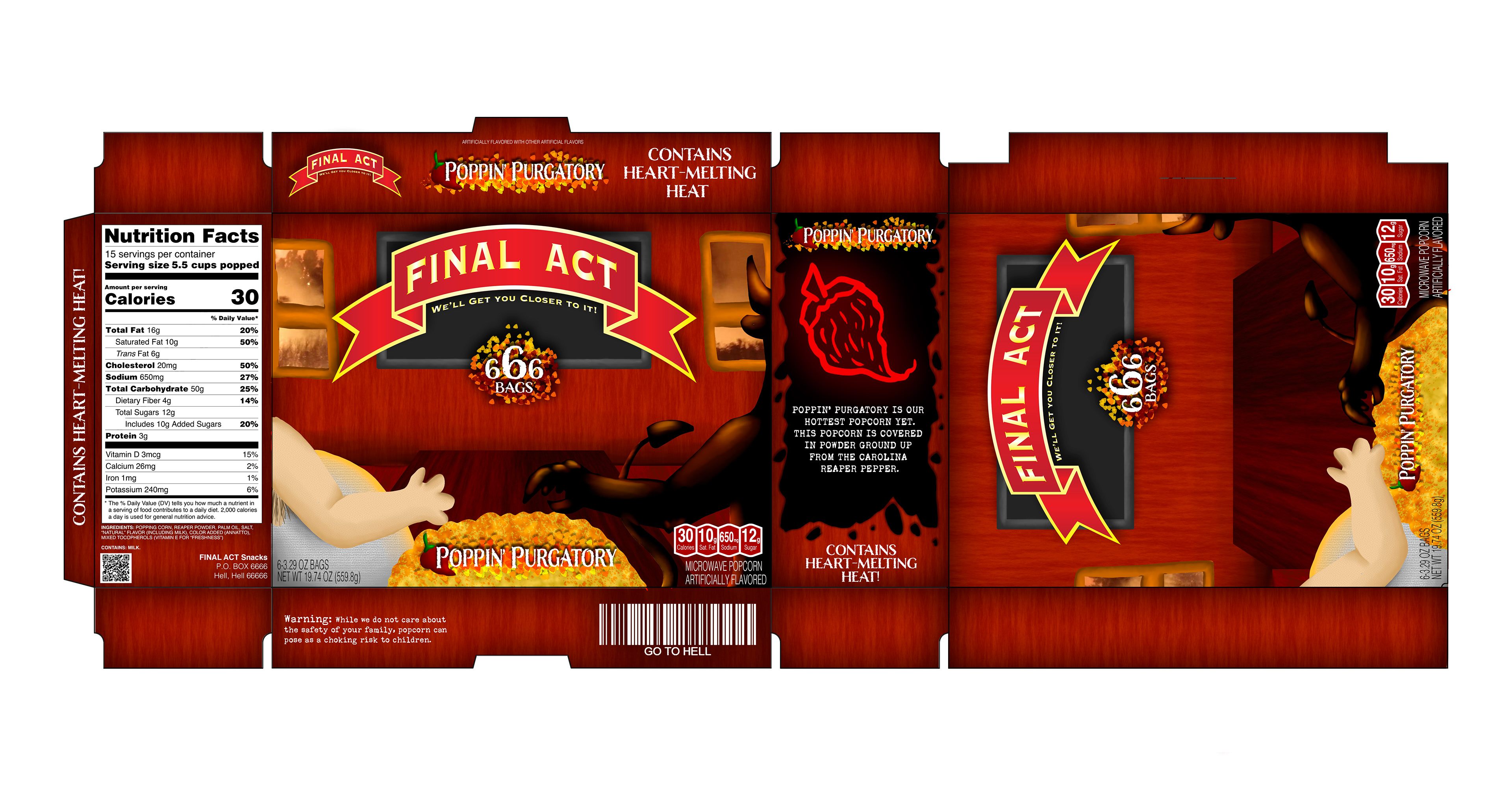
Poppin' Purgatory is my favorite package out of the bunch. This flavor is meant to reference the wildfires that affect the Rocky Mountain West.
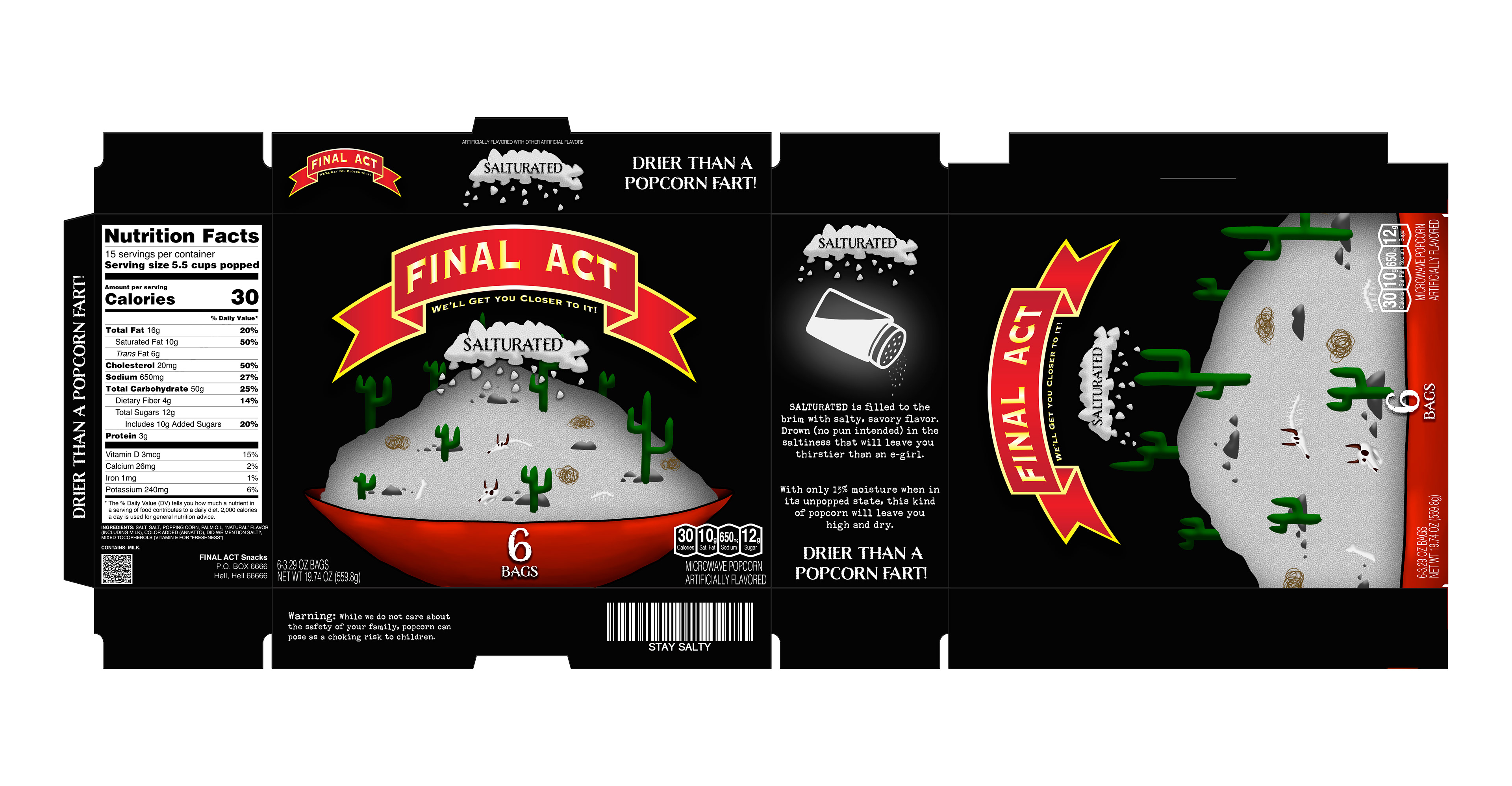
Salturated is meant to reference the droughts affecting the region, as well as the level of salt popcorn can contain (whether its from the consumer or pre-added into the bag).
Packaging
To ease the process of making a dieline, I referenced a Orville Redenbacher's popcorn box. For the ingredients, warning labels, blurb, and barcode; I wanted to add small easter eggs and snarky messages to reflect the brand language.
