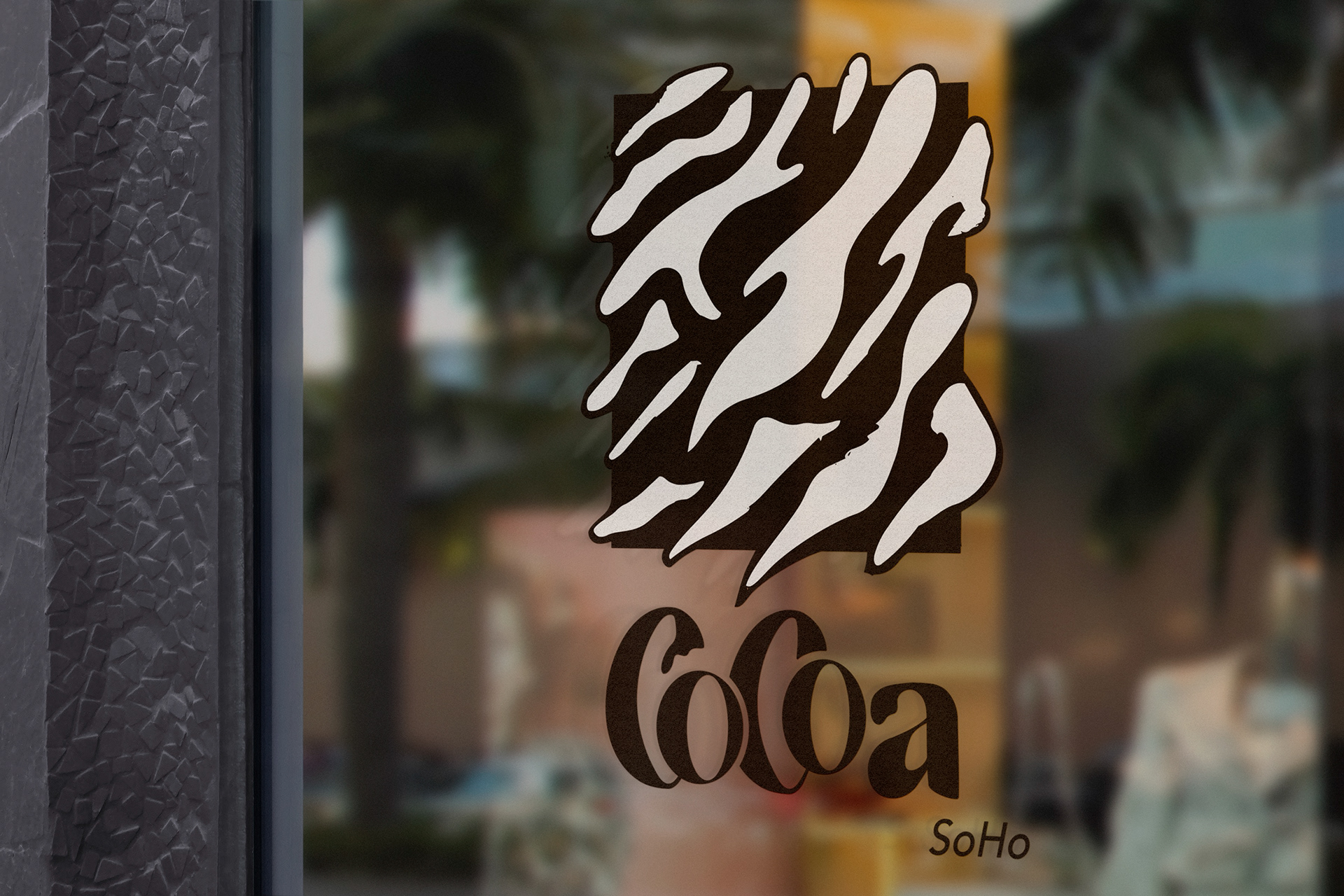
Window Logo. This is the first graphic one would see before entering the hotel.
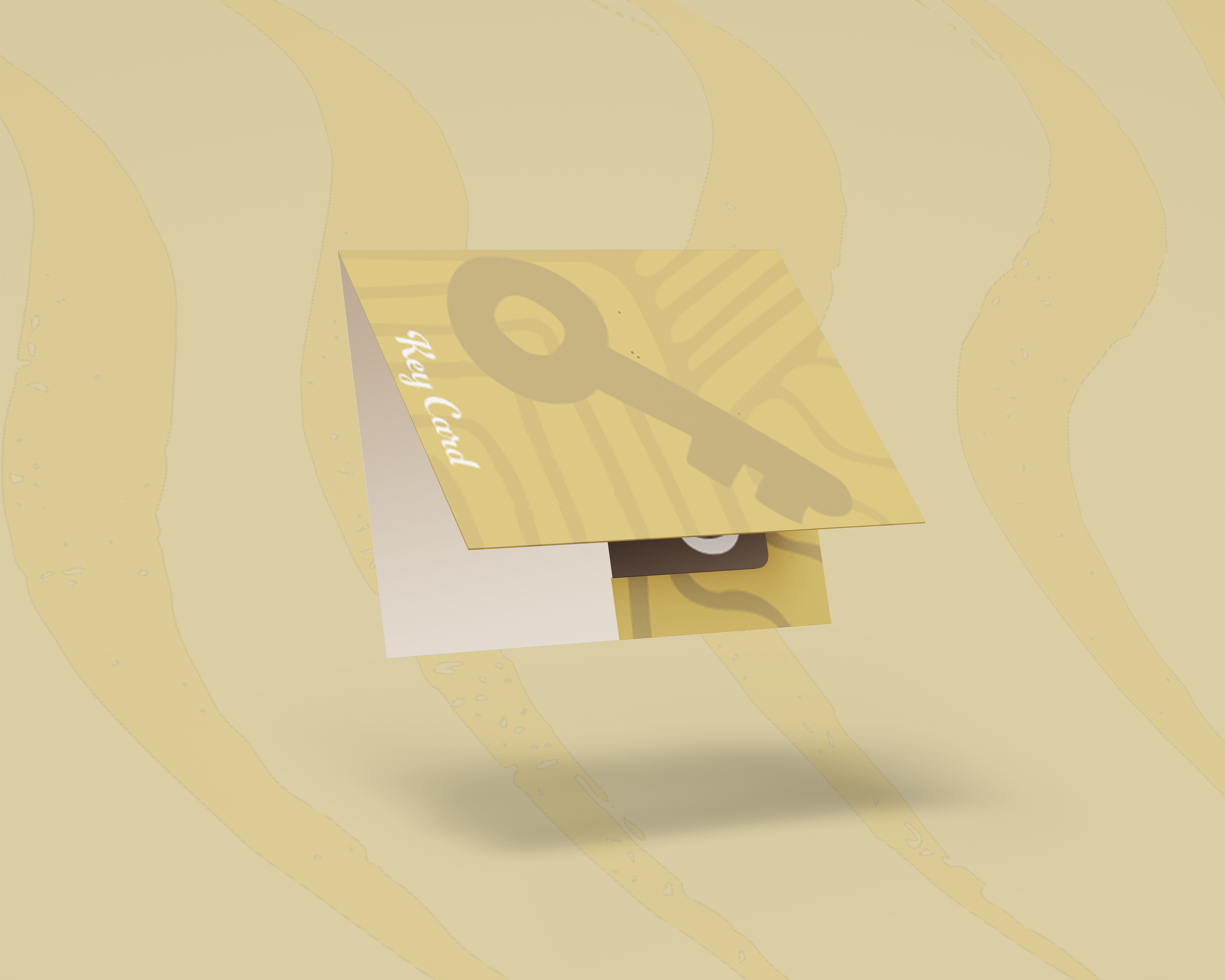
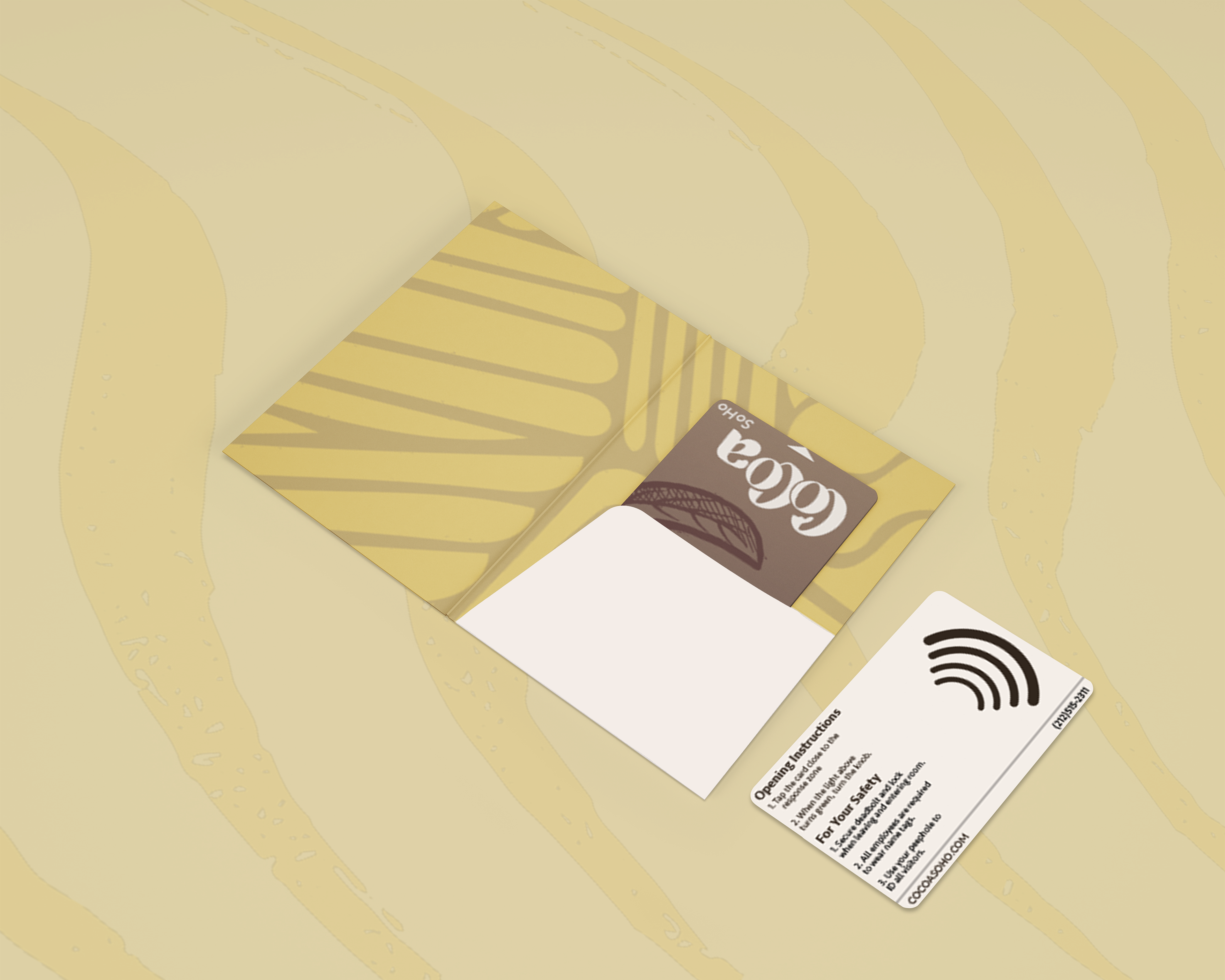
Key card holder. Instead of just receiving your card, we wanted to make it unique by having it in a small little folder to place in your pocket or handbag.

Cup design. I wanted to have textures on everything, this included the paper cups and the plates. I used the wavy pattern on the cup to mimic the steam from a hot cup of coffee.
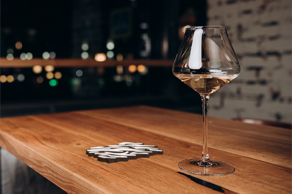
Coaster mockup. Instead of slapping the logo onto a circular puck, I decided that the logo would make a perfect coaster. The white sections of the logo were raised so that it has traction.
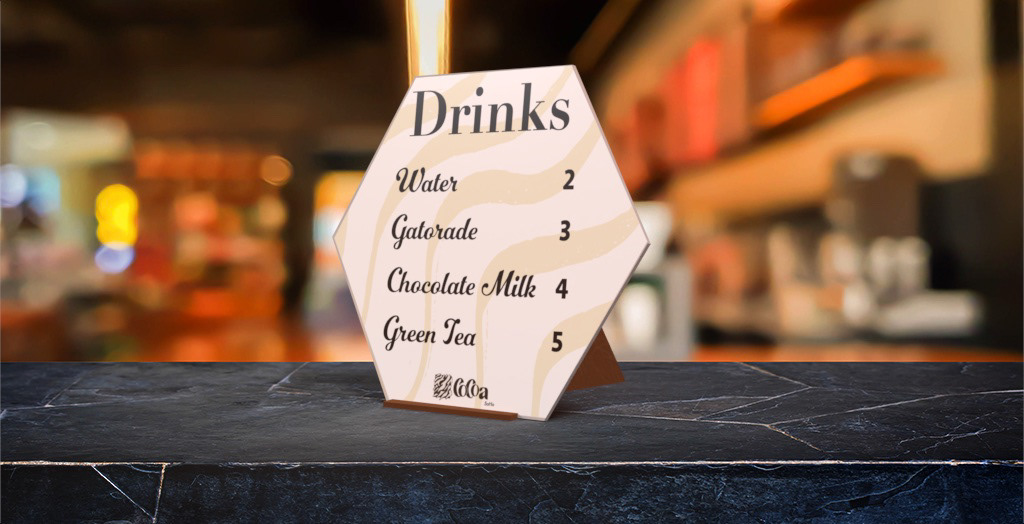
Refreshment Bar menu. After a busy day outside or at the indoor gym, nothing hits better than a refreshing drink. I kept the menu small and simple so that orders can be made quickly. I decided to add wavy lines to reflect a feeling of relaxation, but made them yellow to represent being energized.
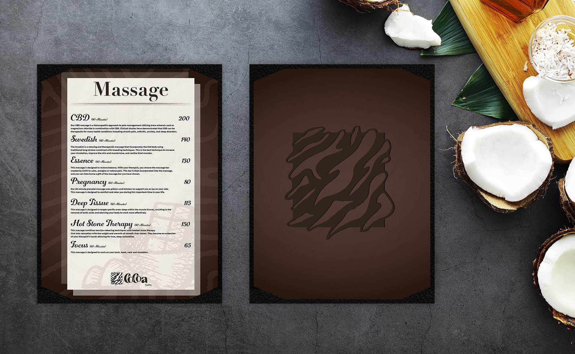
Spa menu. To maximize the luxurious feeling of a spa, I kept the textures smooth and velvety. Once the menu is turned over, you are met with the familiar patterns and spa icon. I wanted to use spa choices that affect different parts of the body. These ranged from a Swedish massage, a hot stone massage, and even a pregnancy massage so that nobody is left out of this experience.
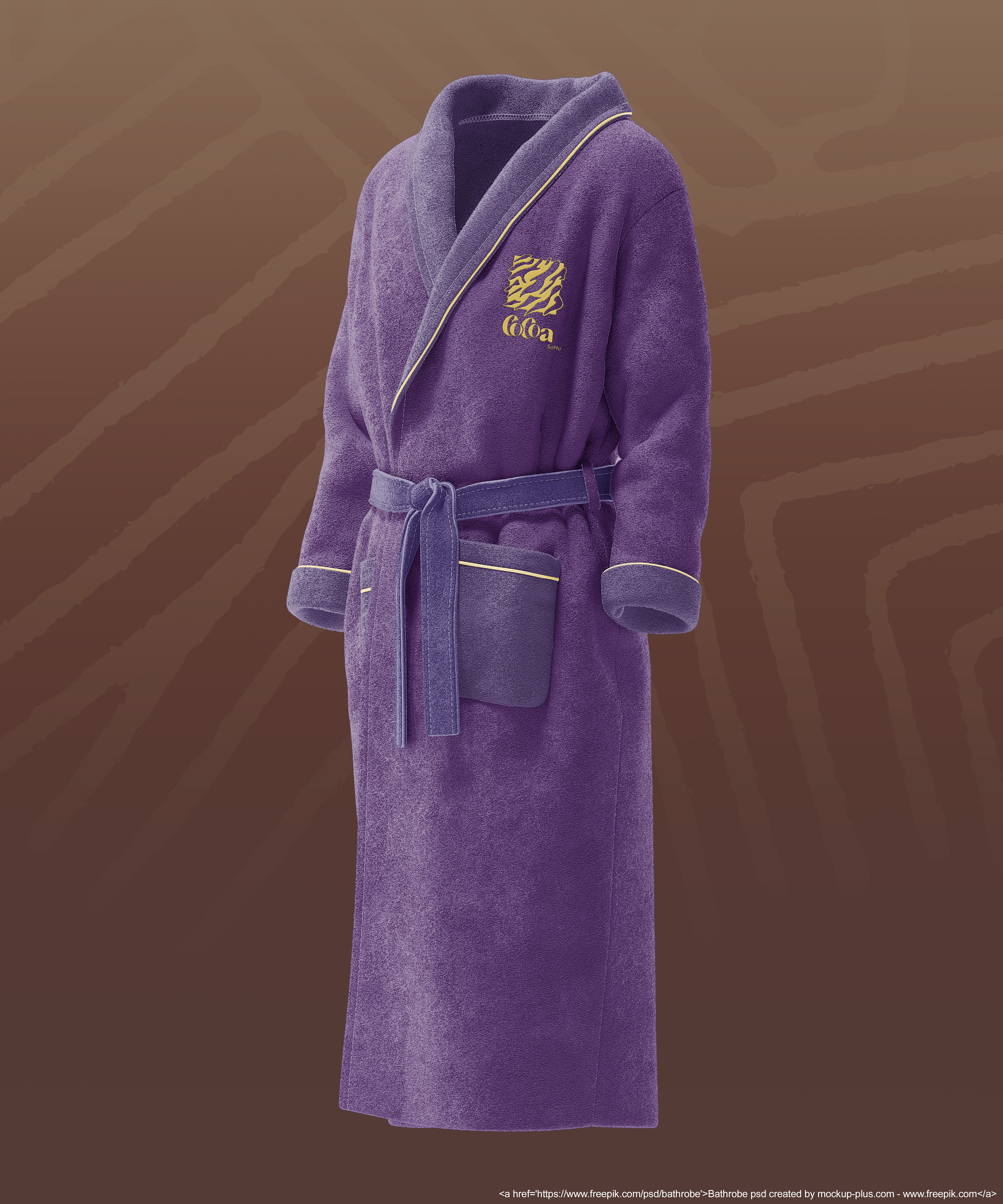
Robe. Using the secondary colors proved to work quite well when designing this robe mockup. I used yellow on the logo so that it would stand out from the purple. Stitches were also given this treatment as well. For the robe, I wanted it to be as puffy as can be to maximize comfort after a session in the spa.
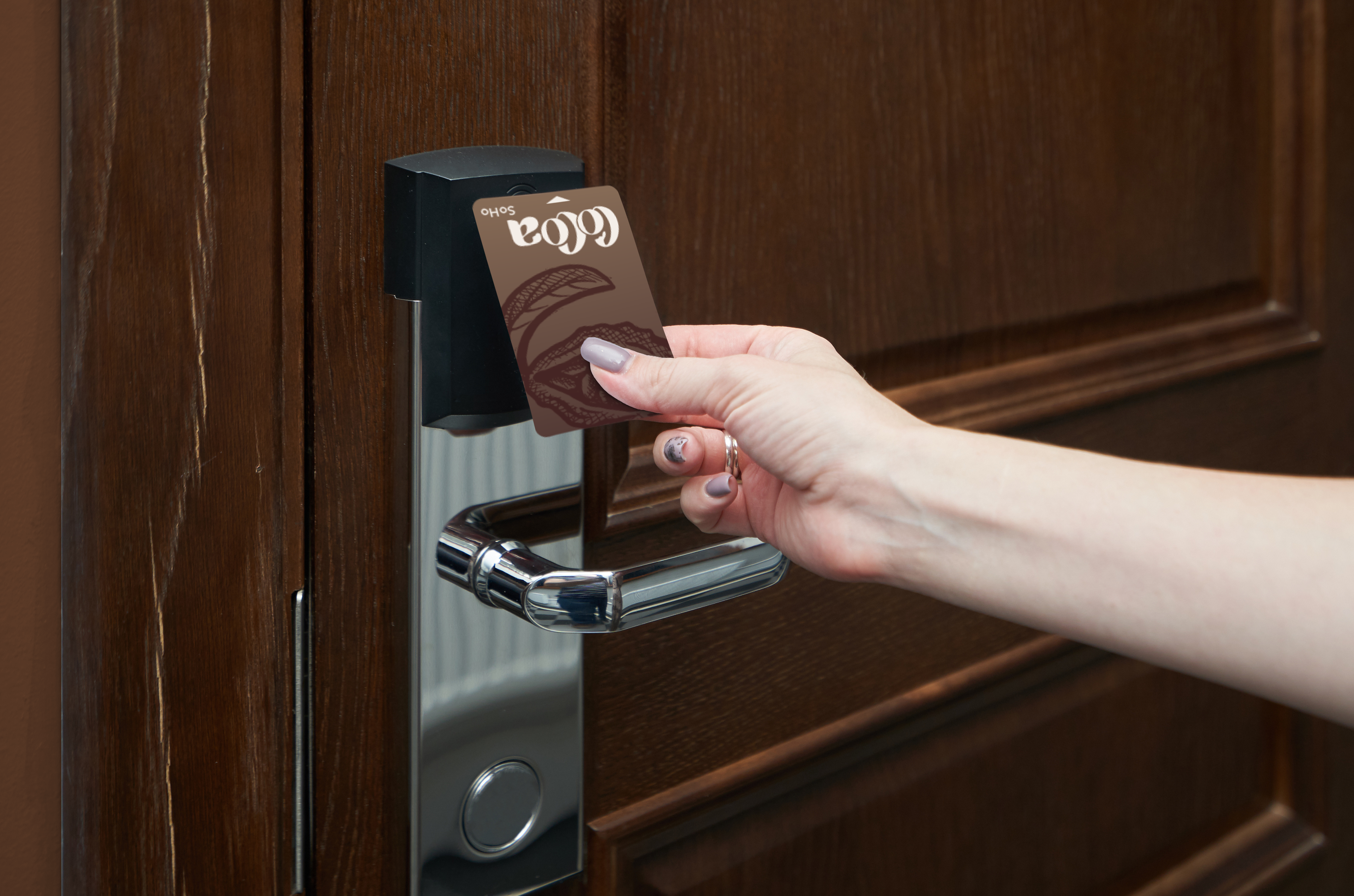
Key card being used. When you enter your room, many small goodies await.

Welcome folder. When you enter your room, this folder greets you when you meet your bed.
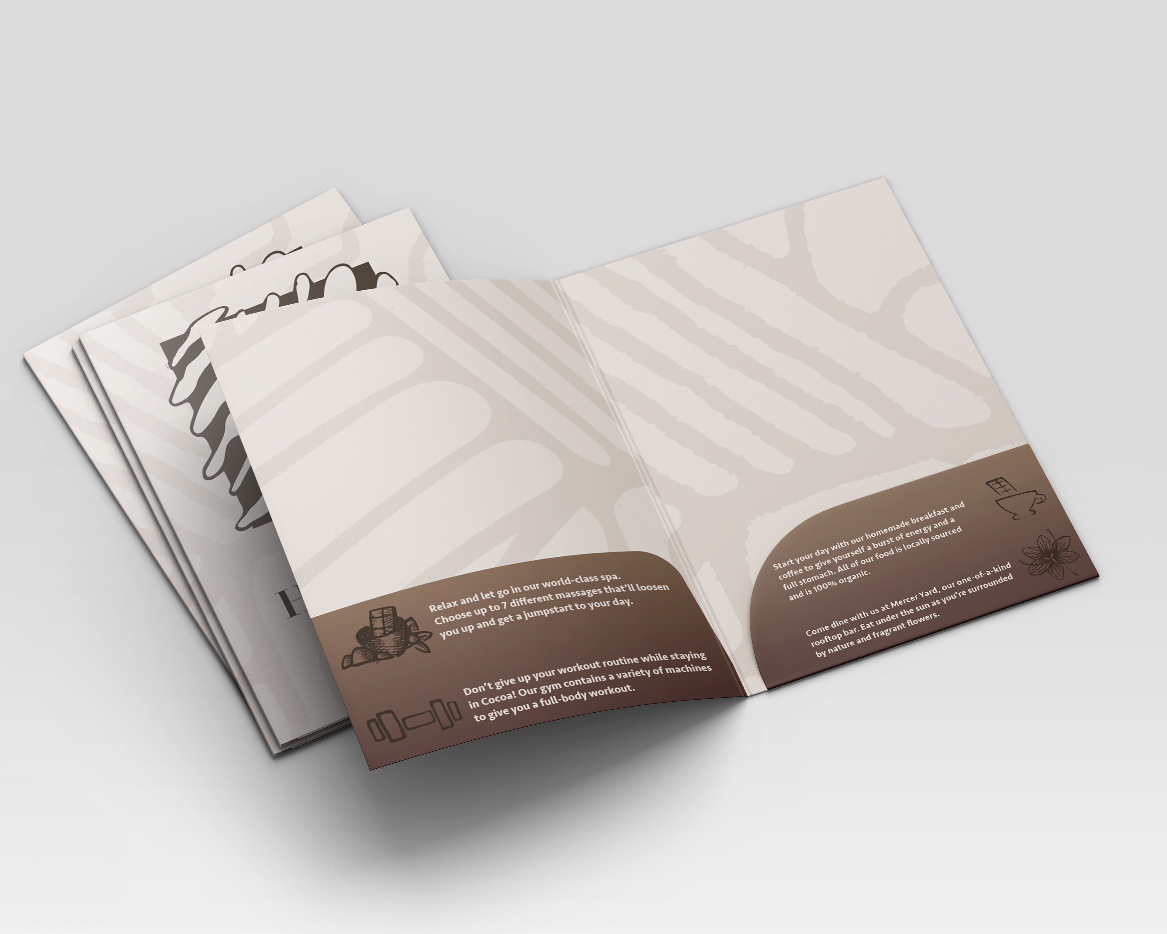
Welcome folder opened. This folder holds contact info, stationary, as well as your keycard when not in use.

Contact sheet. Not even something as simple as a contact sheet escaped Cocoa's branding. Although I kept it subtle for the sake of readability, the textures and patterns still adorn the paper.
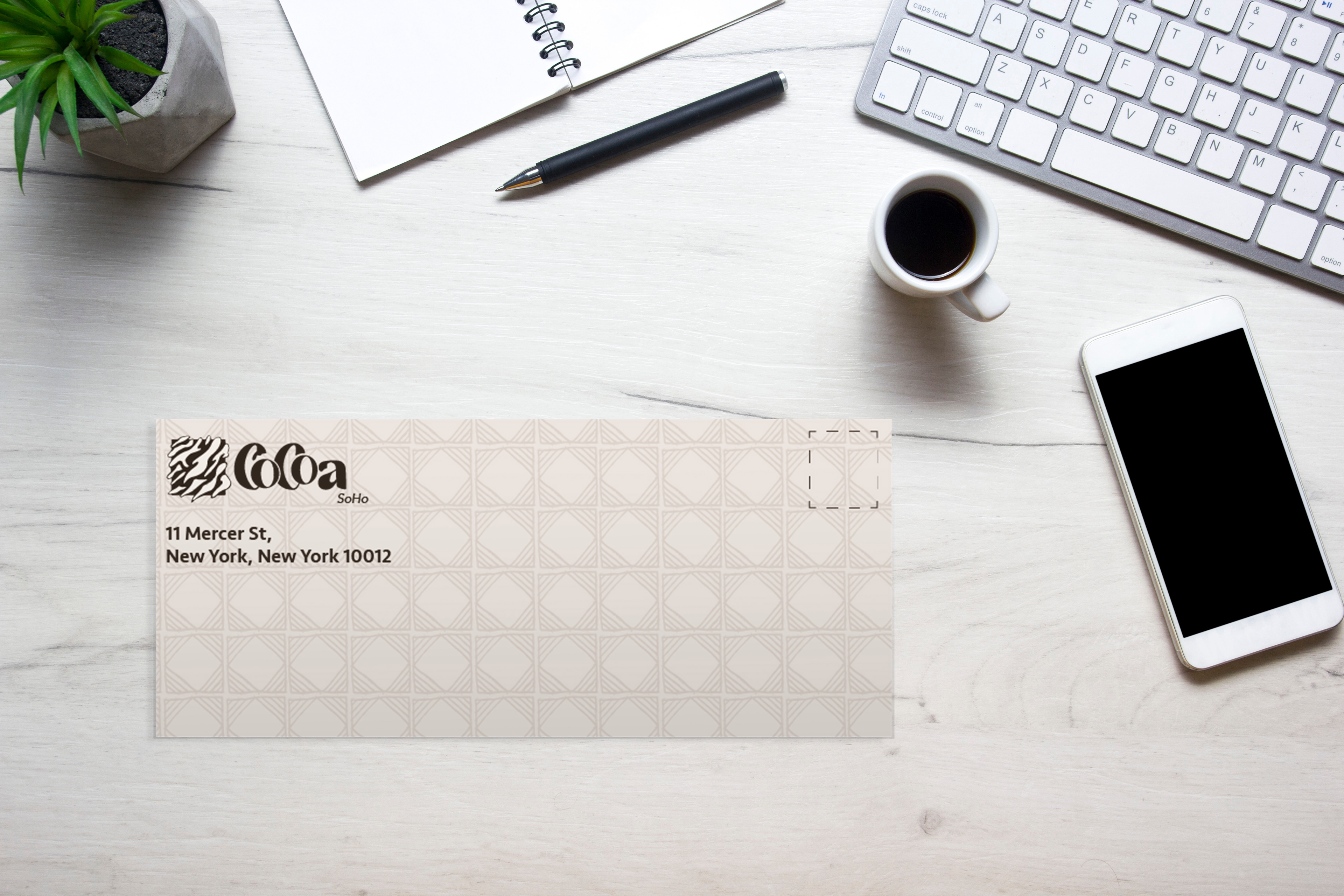
Envelope. An embossed grid texture was applied to the envelopes so that the receiver of this parcel will know thats its something special.
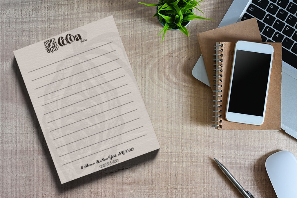
Notepad. Just like the contact sheet, I kept the design subtle for the sake of readability when the guests decides to write something on it. Even with its subtlety, a slight texture and cocoa bean illustration was applied to the paper to match with our branding.

Room service. This was one of my favorite items to mock up. The ability to manipulate the leather texture allowed me to add different raised levels to the cover. Even the inside of the menu was given this treatment.
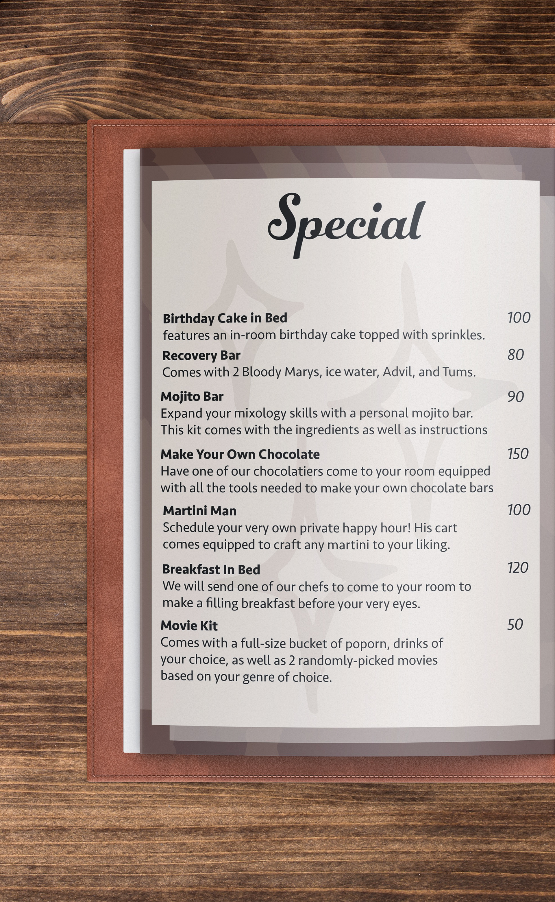
Special room service. Designing the pages for the room service was very fun, as I got to research various hotels and how they did their room service. I narrowed down the breakfast and dinner to common things one would get (with a luxurious touch of course). When doing the Special page, I was surprised on some of the things many hotels are willing to provide to their guests. I edited many to match our brand and even added some unique ones (such as the 'make your own chocolate' service).
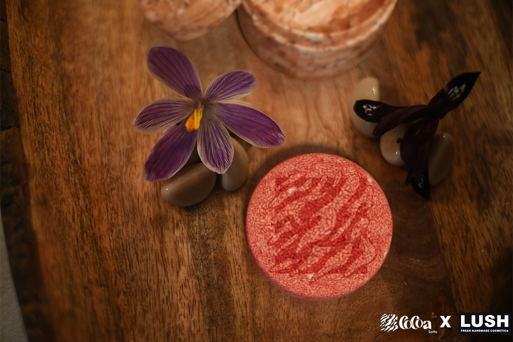
Cocoa X LUSH Collab toiletries. One of the things we were required to do was to do a mockup collaboration with a company. This could range from wines, silverware, to toiletries. I decided to do a collaboration with LUSH since they have many cosmetics that come in various textures and shapes. To get this to work, I bought one of their shampoo bars and set it in a wood dish. In my backyard, I had crocus growing everywhere. I used them as decoration and snapped a picture. I took this image into Adobe Dimension and added a holder for the shampoo bar. These bars can last up to 80 washes, so I figured it would make sense to have a custom holder to take it home with.
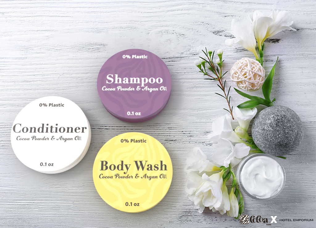
Powdered toiletries. We didn't settle for one set of toiletries, we decided to go with two so that our guests had a choice. My partner found a company that makes powdered shampoo, conditioner, and body wash. Since there was no clear way to mimic the packaging, I decided to put it packaging that matched our brand much more.
Brand Collateral 1: Chocolate

Business card holder (closed). A lot of thought went into making the business card. While making the card could've been a one n' done job, I wanted to expand on it a bit further and make it more unforgettable. I researched around and found that there were business card holder that contain a bit of chocolate as a welcoming treat. I thought that was a perfect idea and used references from vendors to make a custom dieline for the holder. The holder was made out of thick, purple card stock. The logo was made from vinyl that I had to remove by hand.
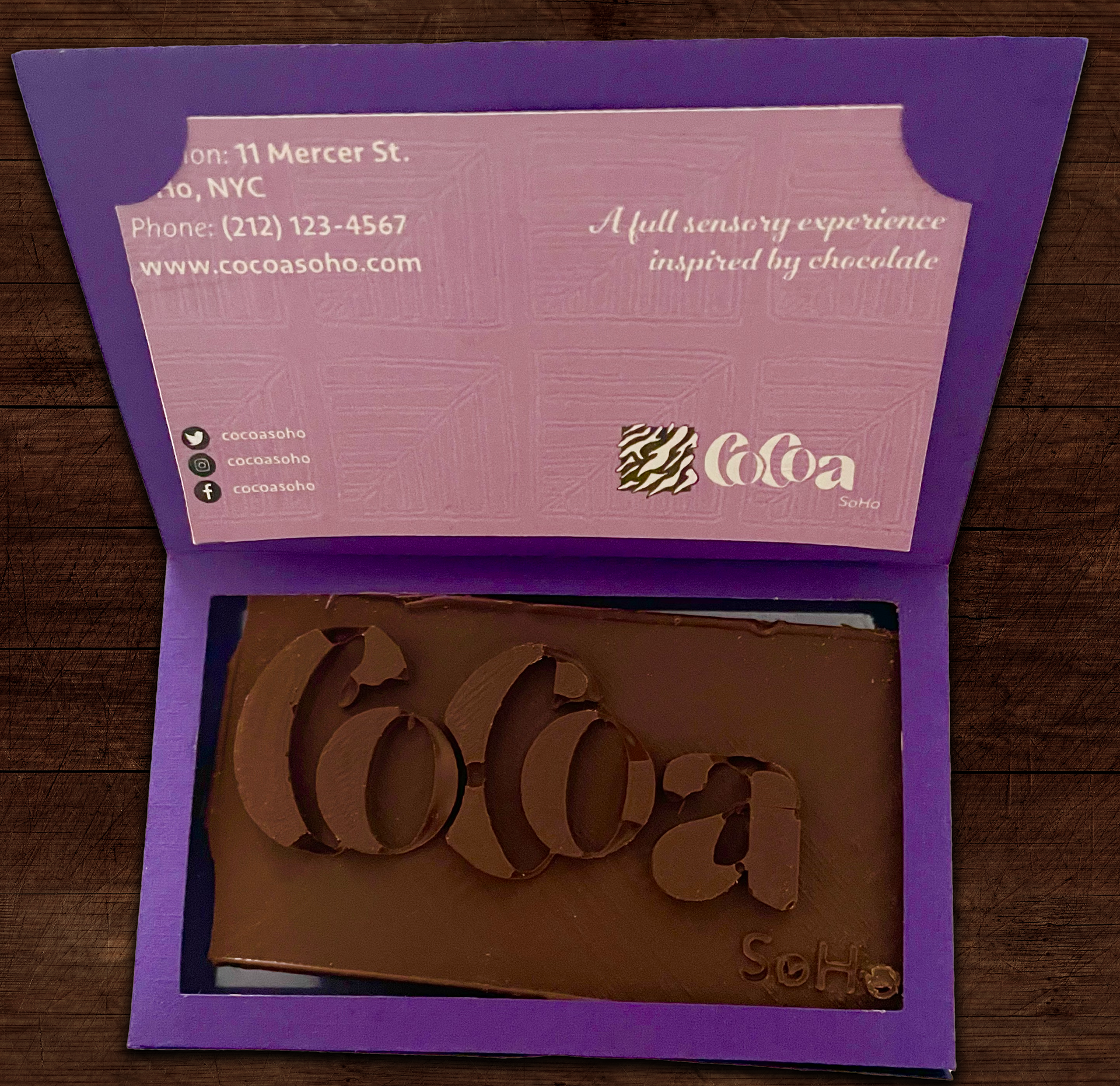
Business card holder (open). The chocolate was the hardest item to make during this entire project. I began the process by making a chocolate mold of our wordmark in Blender. After making a mold, I got the mold 3D printed with the help of a fellow classmate. With the mold complete, I bought food-safe silicon mold solution from a craft store. I poured the silicone and the 3D printed mold into a container. After it cured, I started making the chocolate by using melting wafers. Around 30 of these bars had to be made, which took around 15 hours in total (if you include melting, pouring, freezing, and cutting the excess).
Brand Collateral 2: Hotel App
To reflect New York's fast-paced culture and environment, I settled on making an app for the hotel rather than a website. The app would be more mobile-friendly and can be used on the spot. People shouldn't have to wait to get home or to their office to book a room, rather, it'd be easier and faster to download the app and go from there. To reinforce our idea of our hotel being a sensory experience, all of the icons use our signature patterns and the images can be moved around with the user's finger to get a panoramic experience.
Embedded here is is the actual app. Feel free to interact with it. Don't forget to wiggle the images, as there is more than what meets the eye.
Process
Mindmap
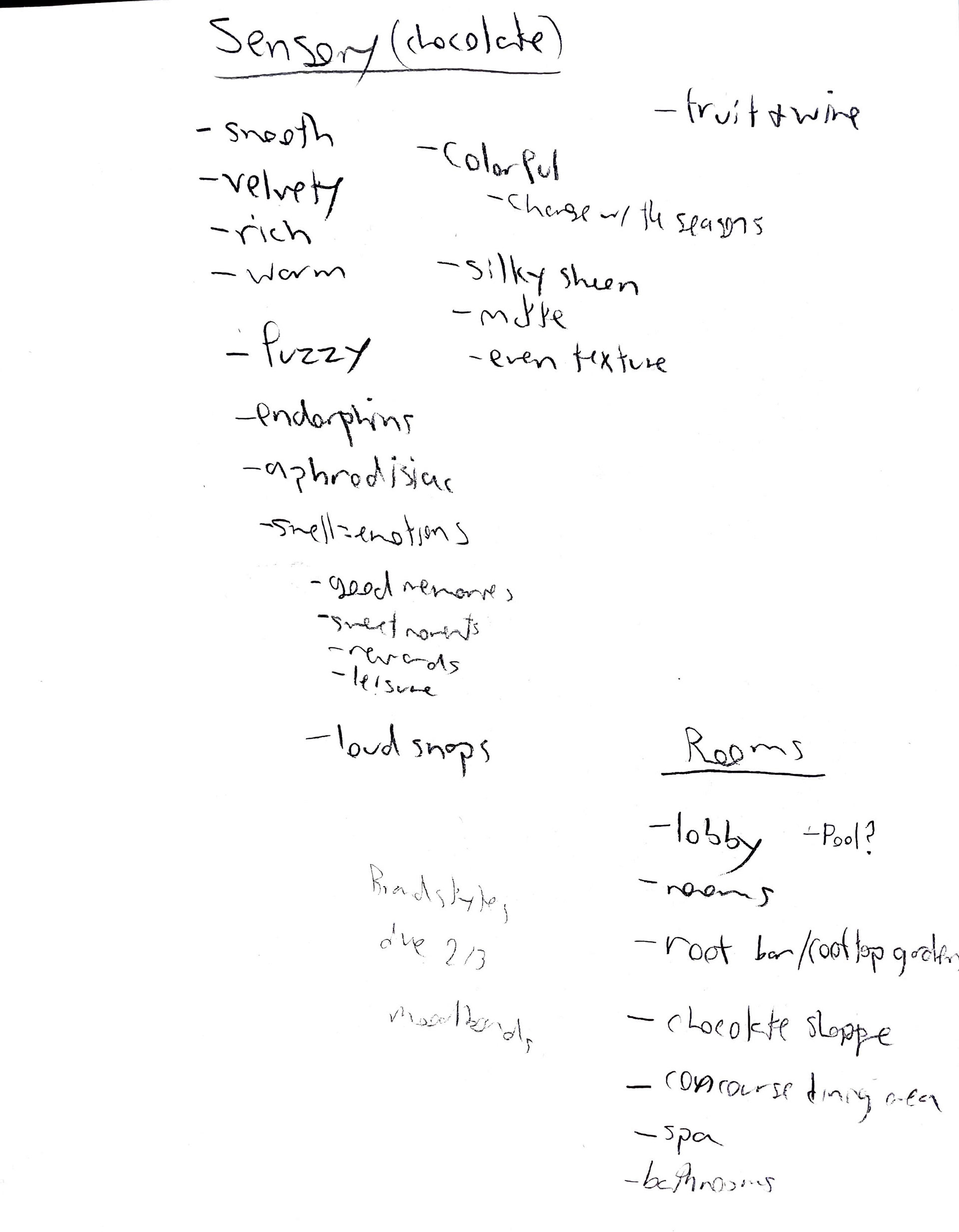
Sensory list
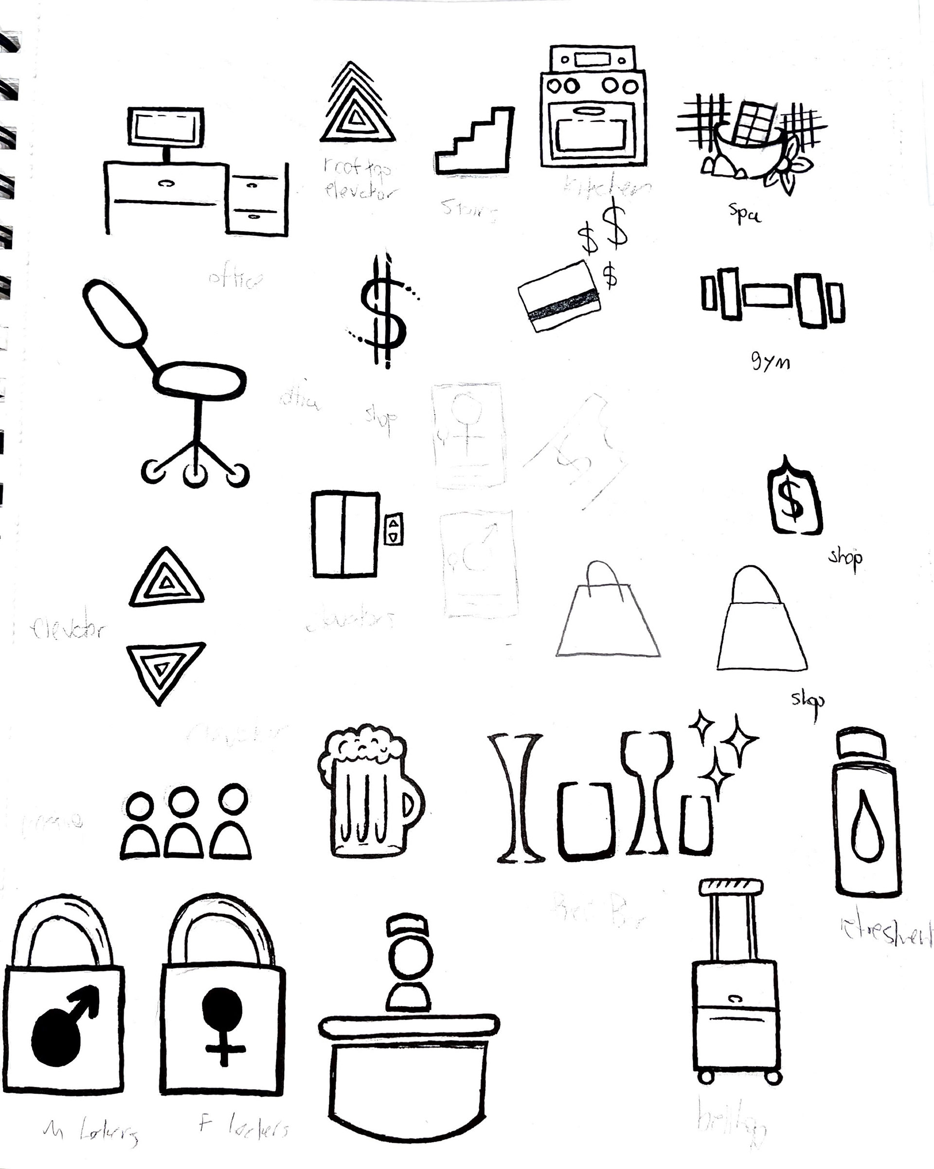
Iconography
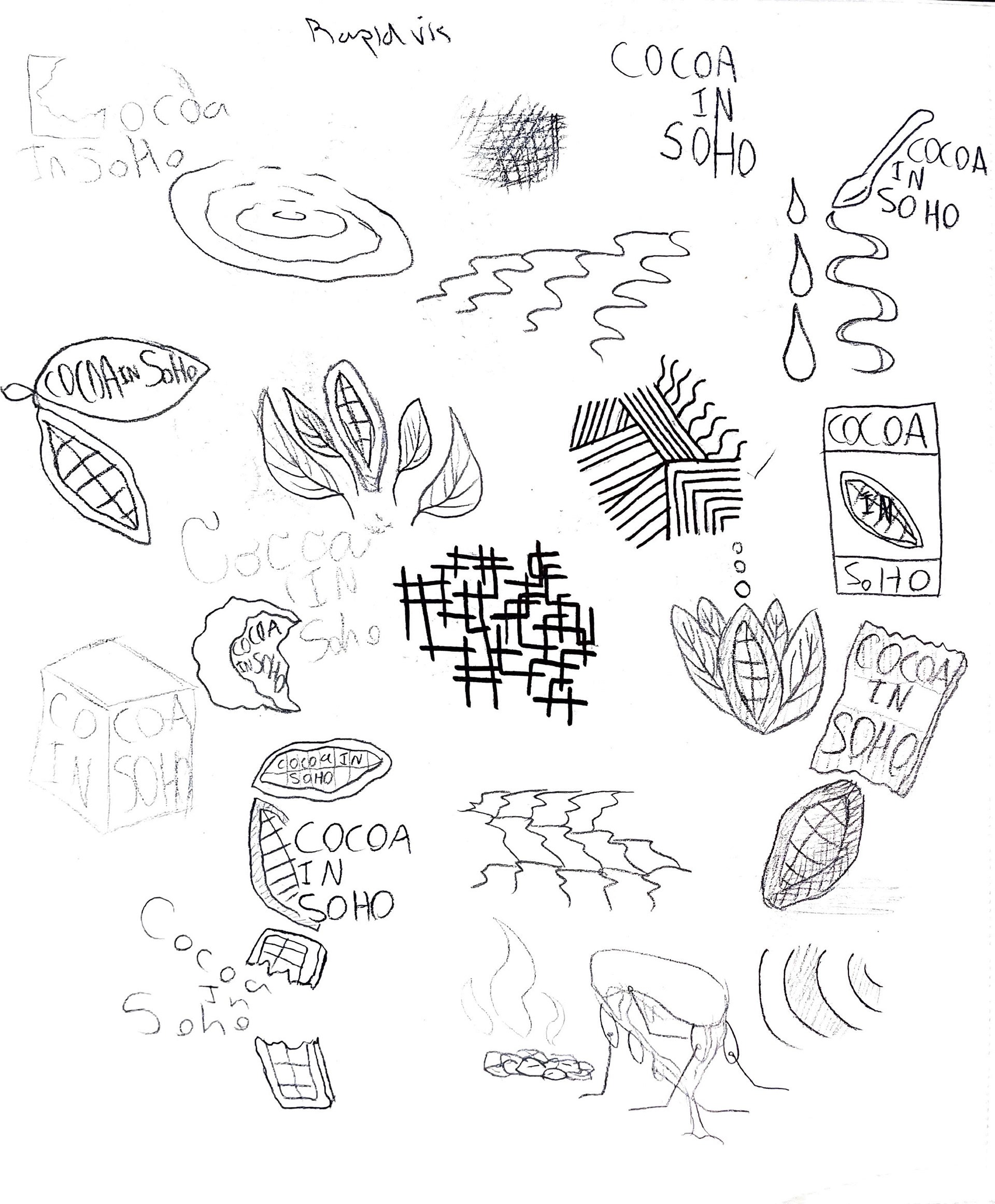
iconography/patterns/logos
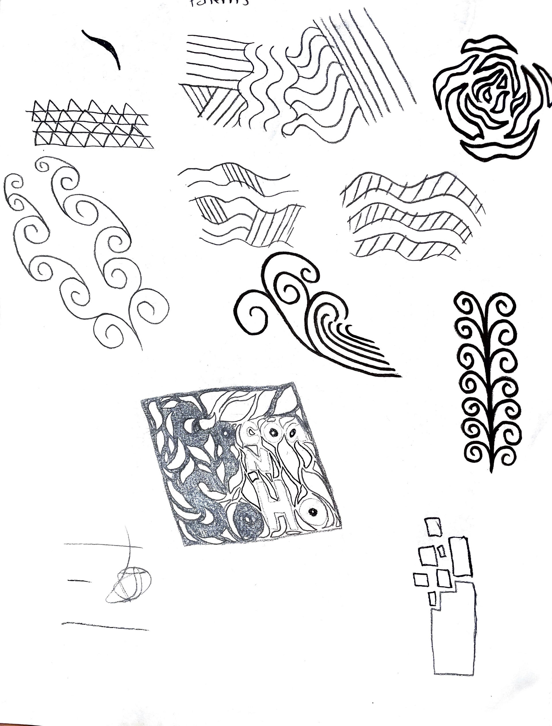
textures/patterns
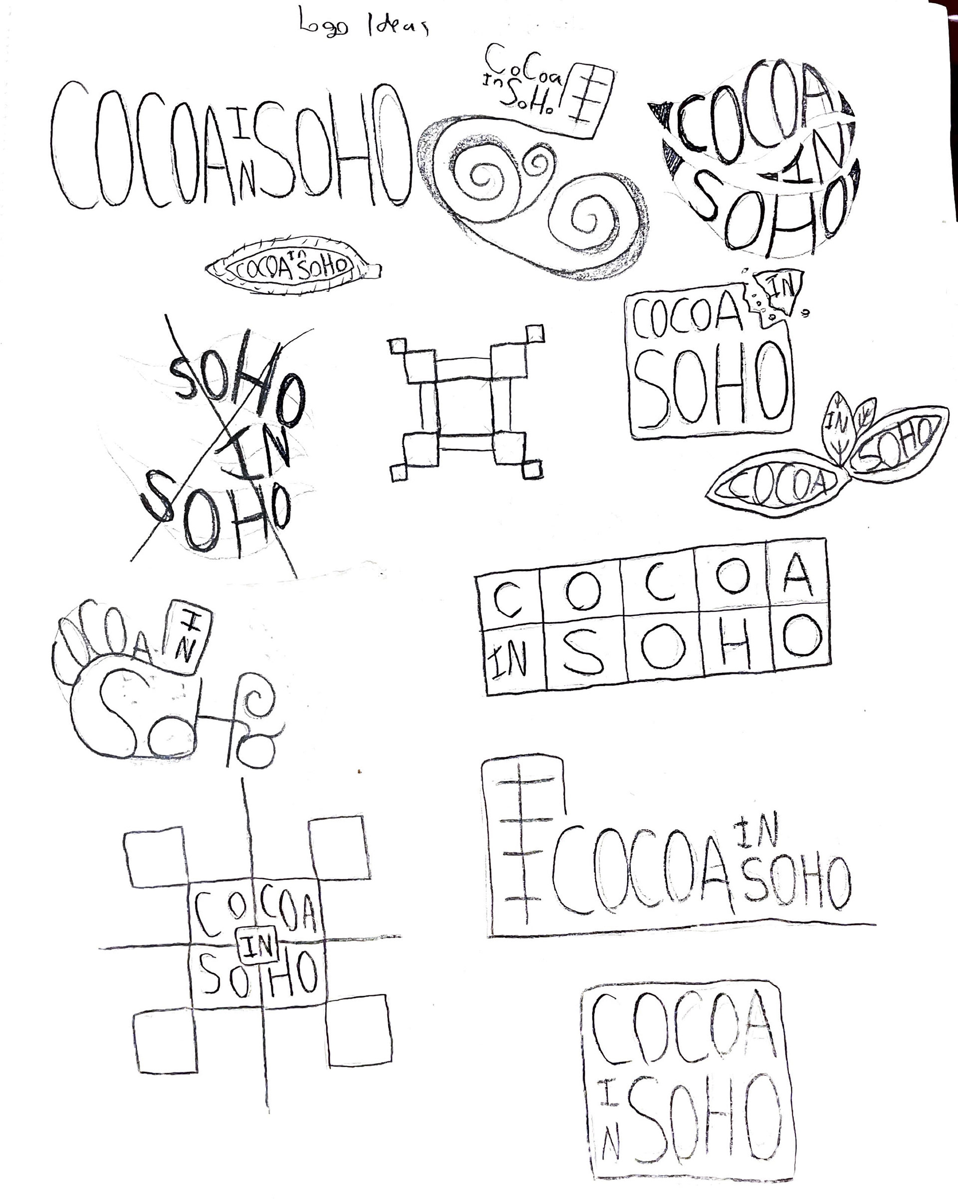
Logos
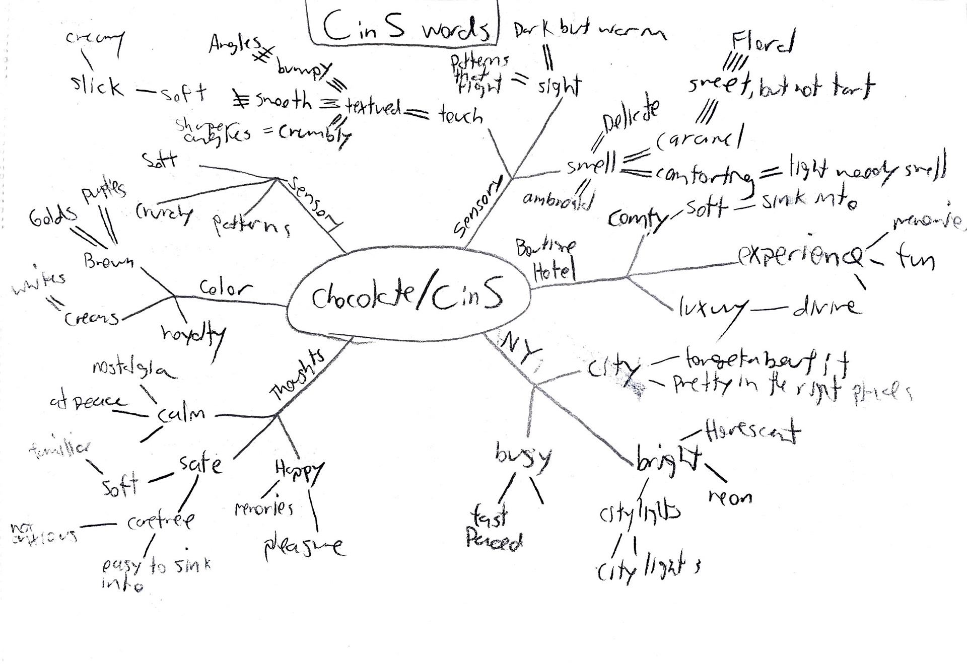
The process behind the brand was one of the hardest steps when designing the hotel. With our word being chocolate, we knew that adding chocolate patterns and candy everywhere wouldn't cut it. It would be too cliche, predictable, and un-creative. To remove any cliche ideas, we decided to base our designs on how chocolate affects the senses and how you can mold chocolate into any shape you want. We spent special attention to touch, and how chocolate can have various textures based on the recipe. This attention to texture drove the branding and the graphics behind the signs, icons, menus, folders, and other physical and digital deliverables.
For the brand voice, we wanted it to be sophisticated but friendly. For the color palette, we used brown colors with contrasting cream colors. We decided to add these lighter colors because we were aware that chocolate can also come in these said colors, such as white chocolate. These were supposed to be the more casual and friendlier colors that would become the primary palette. To nail that feeling of luxury and sophistication, we used rich purples and golds as our secondary palette.
For our icons and patterns, all of them started off in a sketchbook. To obtain a hand-written and grainy appearance, I used Adobe Capture to scan the image and convert it into a shape. Not only did this enforce the textured designs we wanted, but also gave a sense of luxury with the fact that these icons and patterns were hand-made.
