Branding
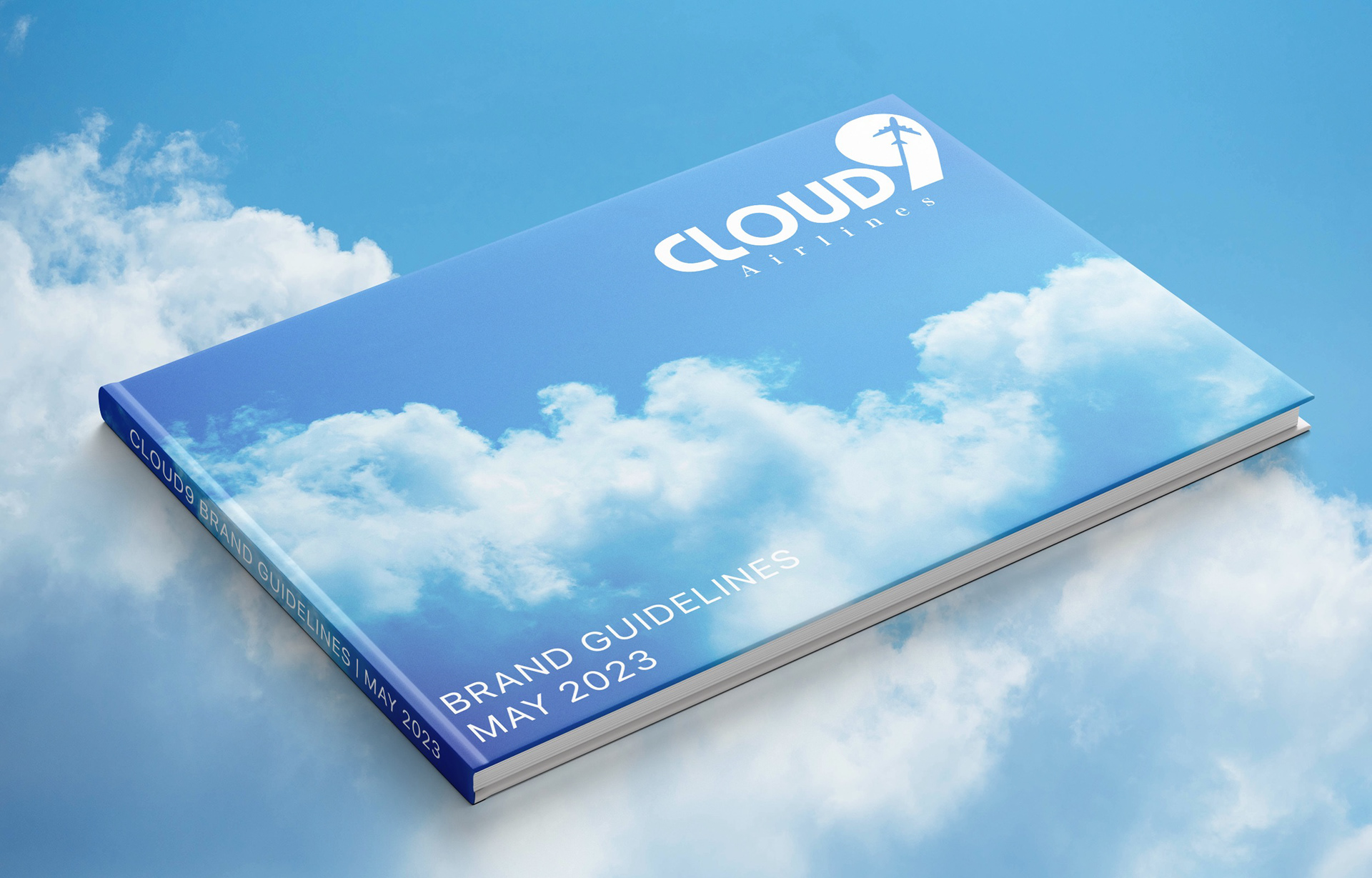
Brand Guidelines Cover.
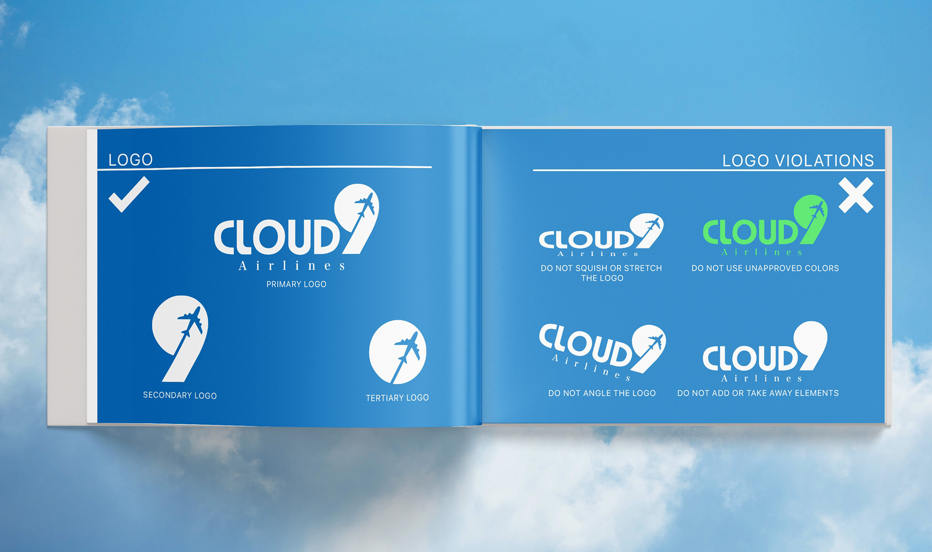
Logo Rules and Violations.
Cloud9's branding was inspired by the design style Frutiger Aero, an early 2000s surreal design style that emphasized nature, cloudy skies, and lots of cool colors such as green and blue. This design helped build Cloud9's photographic style, color palette, and voice. Instead of focusing on the destination, Cloud9 focuses on the trip itself. This focus on the flight and passenger comfort led to the deliverables to focus on clouds, stars, and the moon.
Advertisements
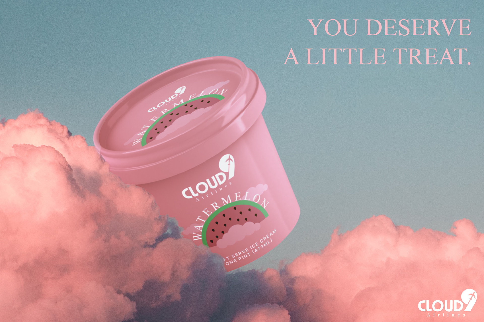
Cloud9's Signature Strawberry Ice Cream Ad.
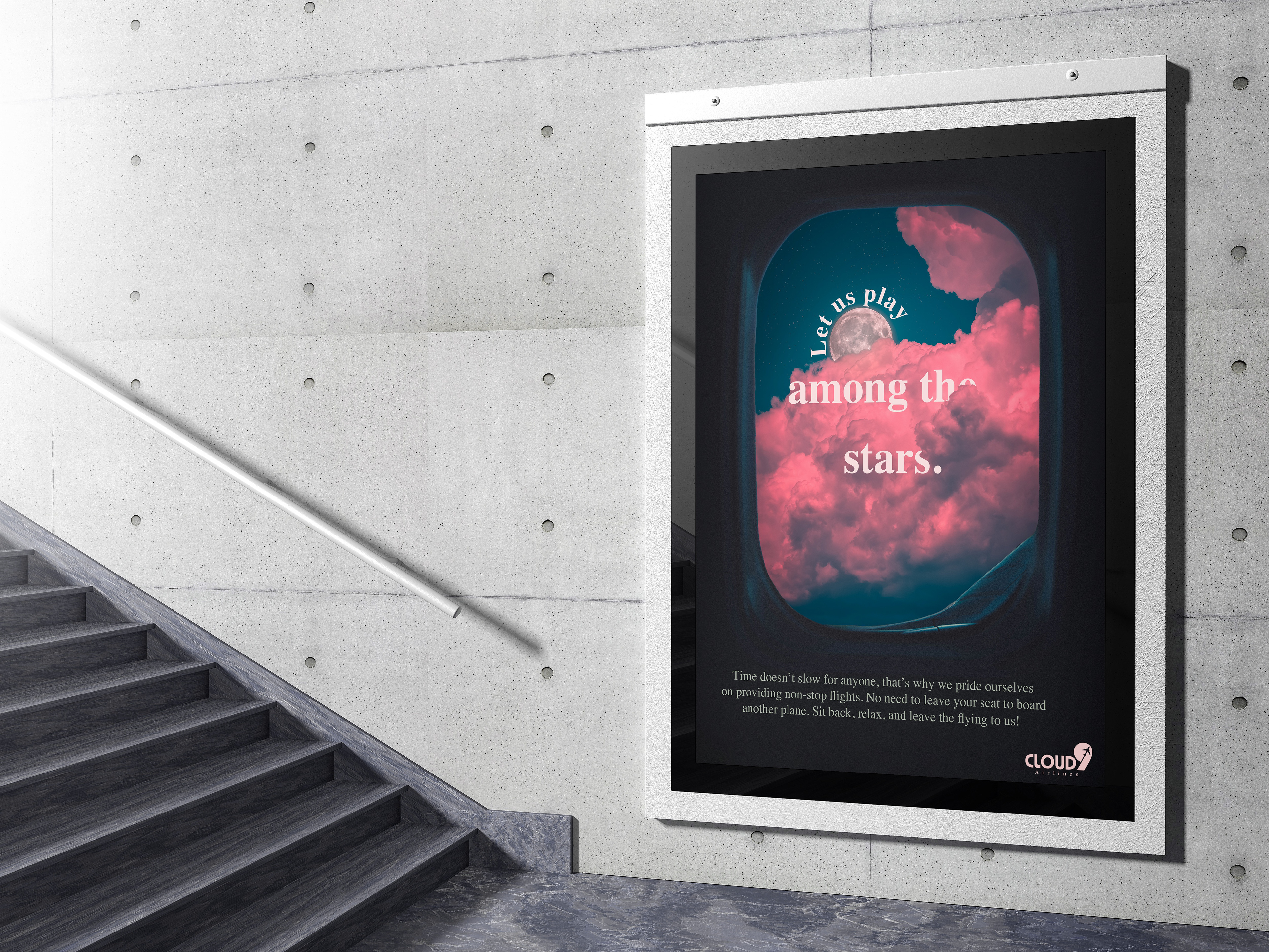
Nighttime Ad showing off Cloud9's non-stop flights.
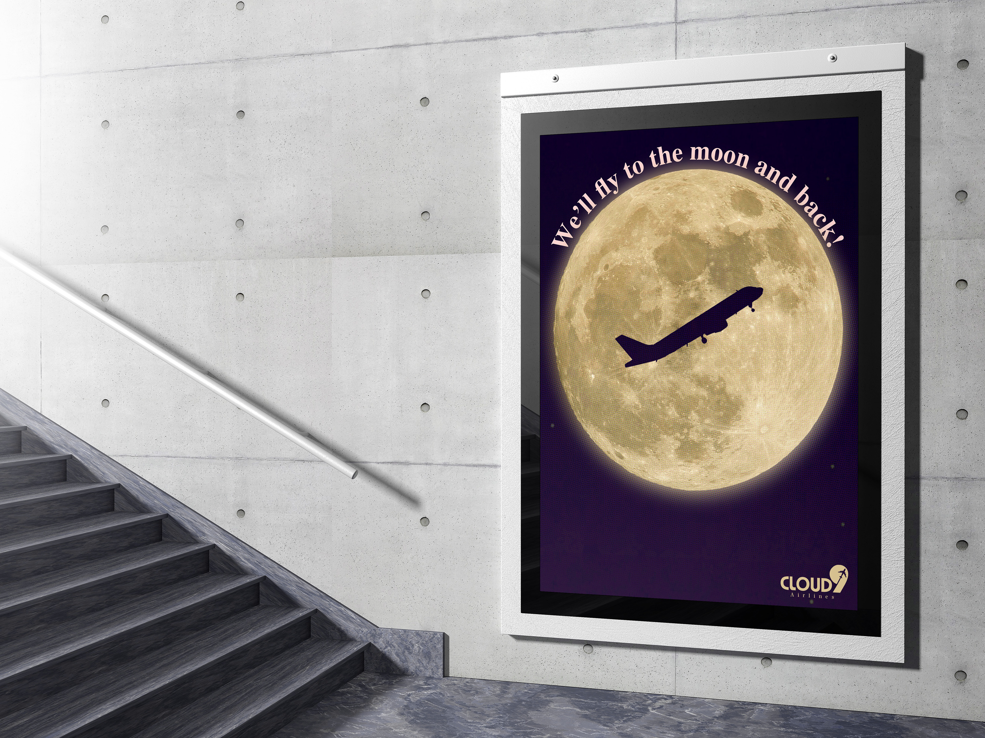
Moon Ad.
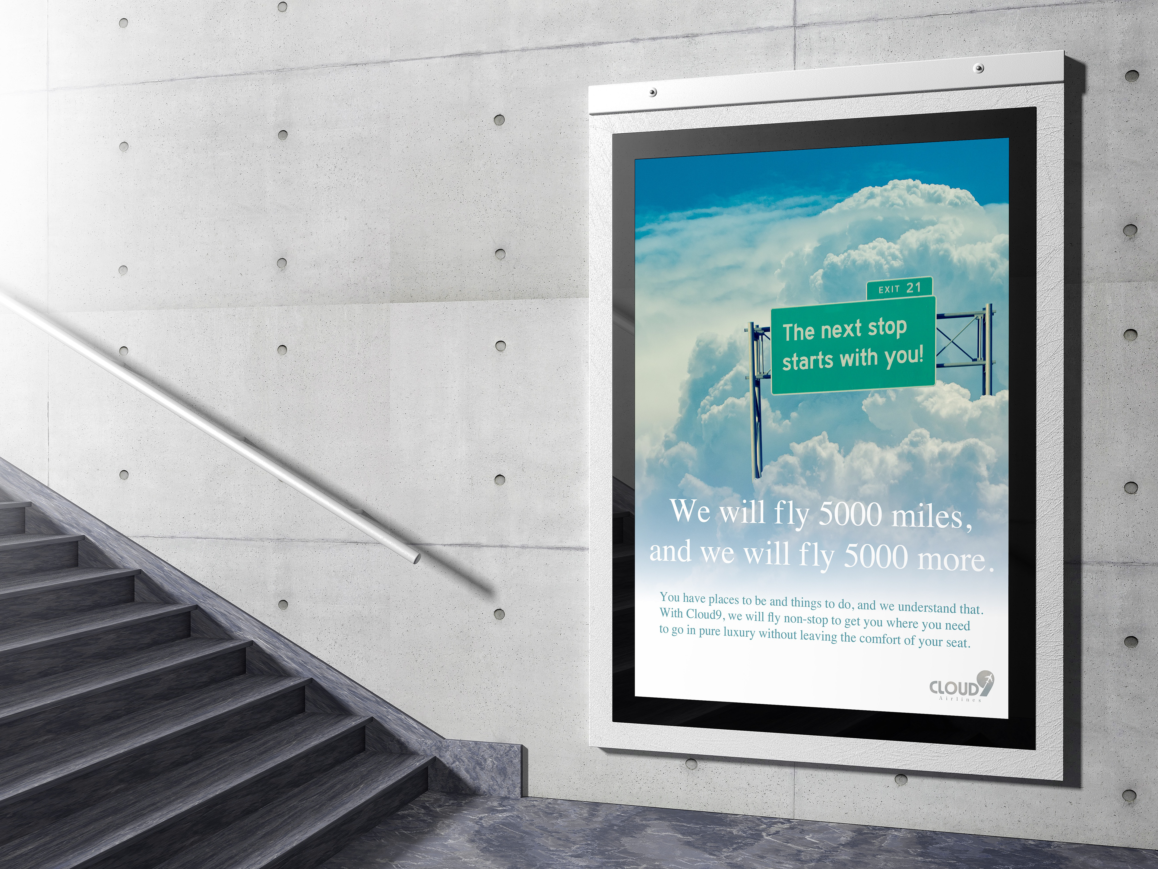
Skyway Ad showing off Cloud9's non-stop flights and their extensive flight path limit.
Design Collateral
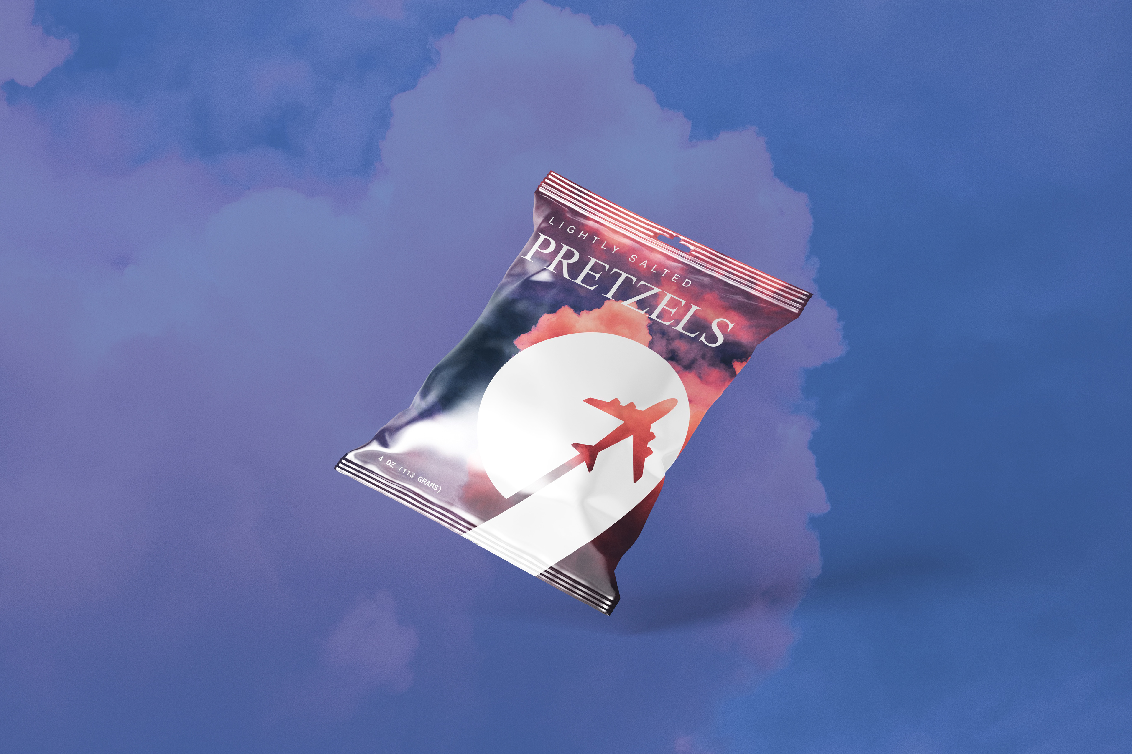
Mini pretzel packaging.
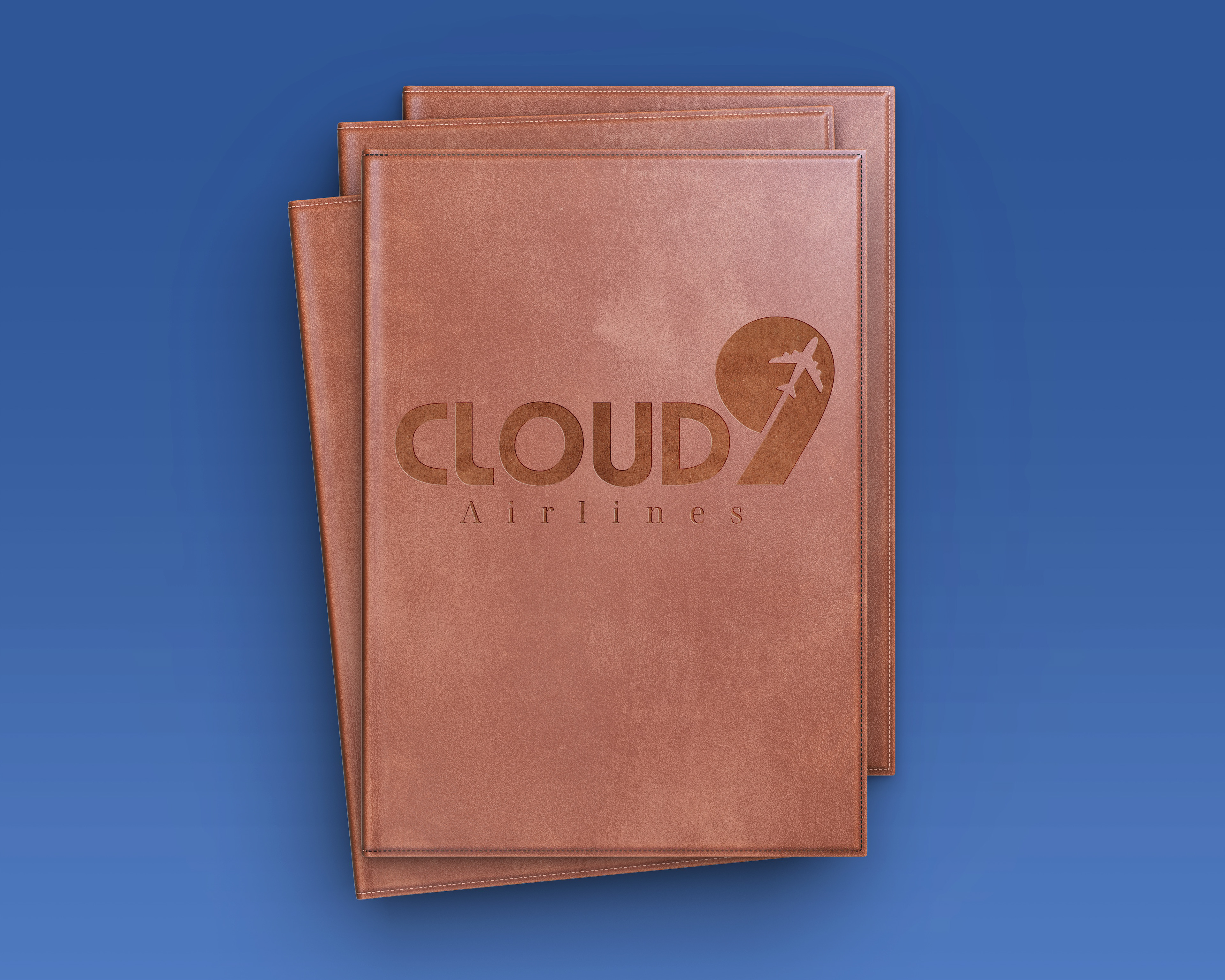
Food menu cover.
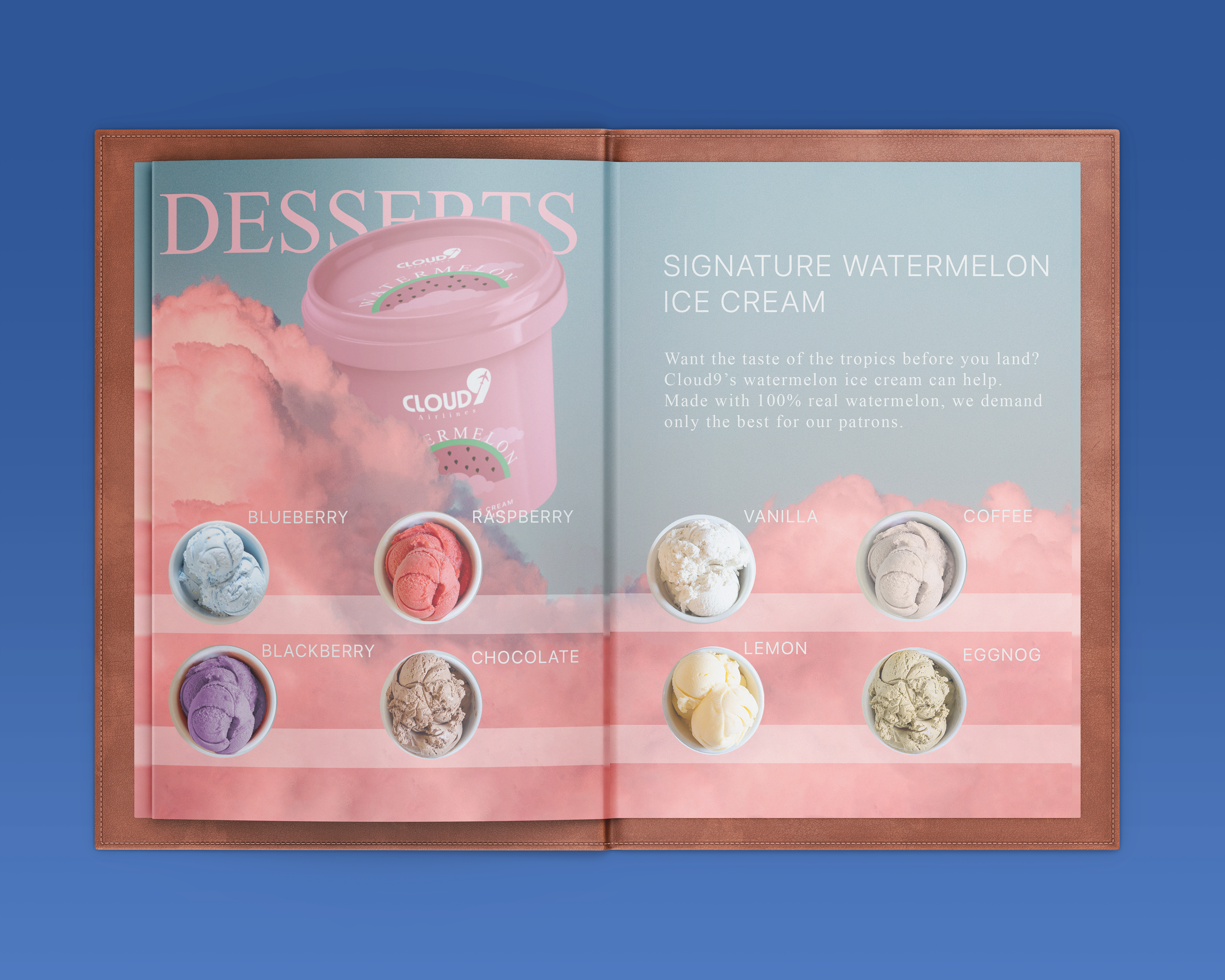
Menu mockup.
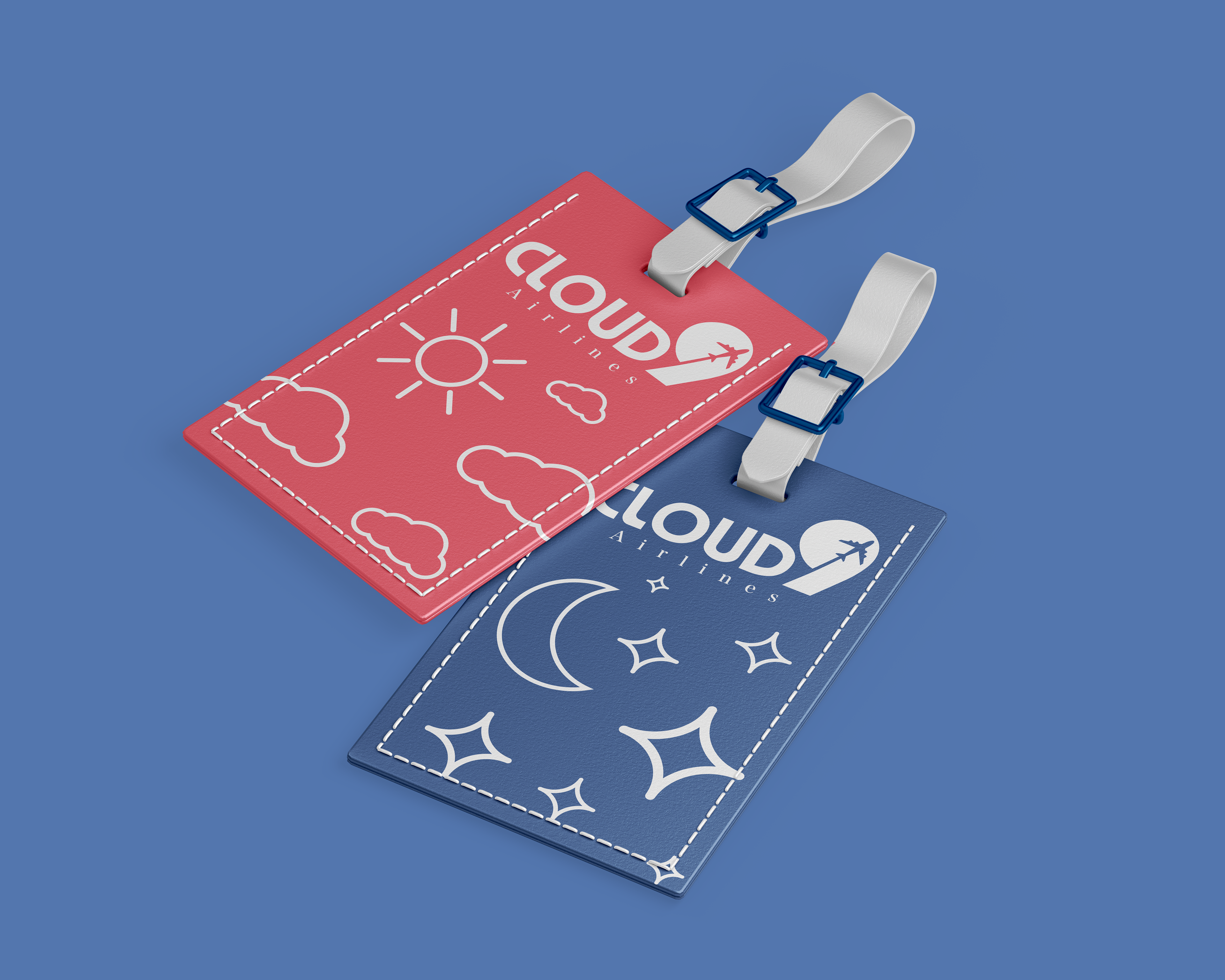
Luggage tags.
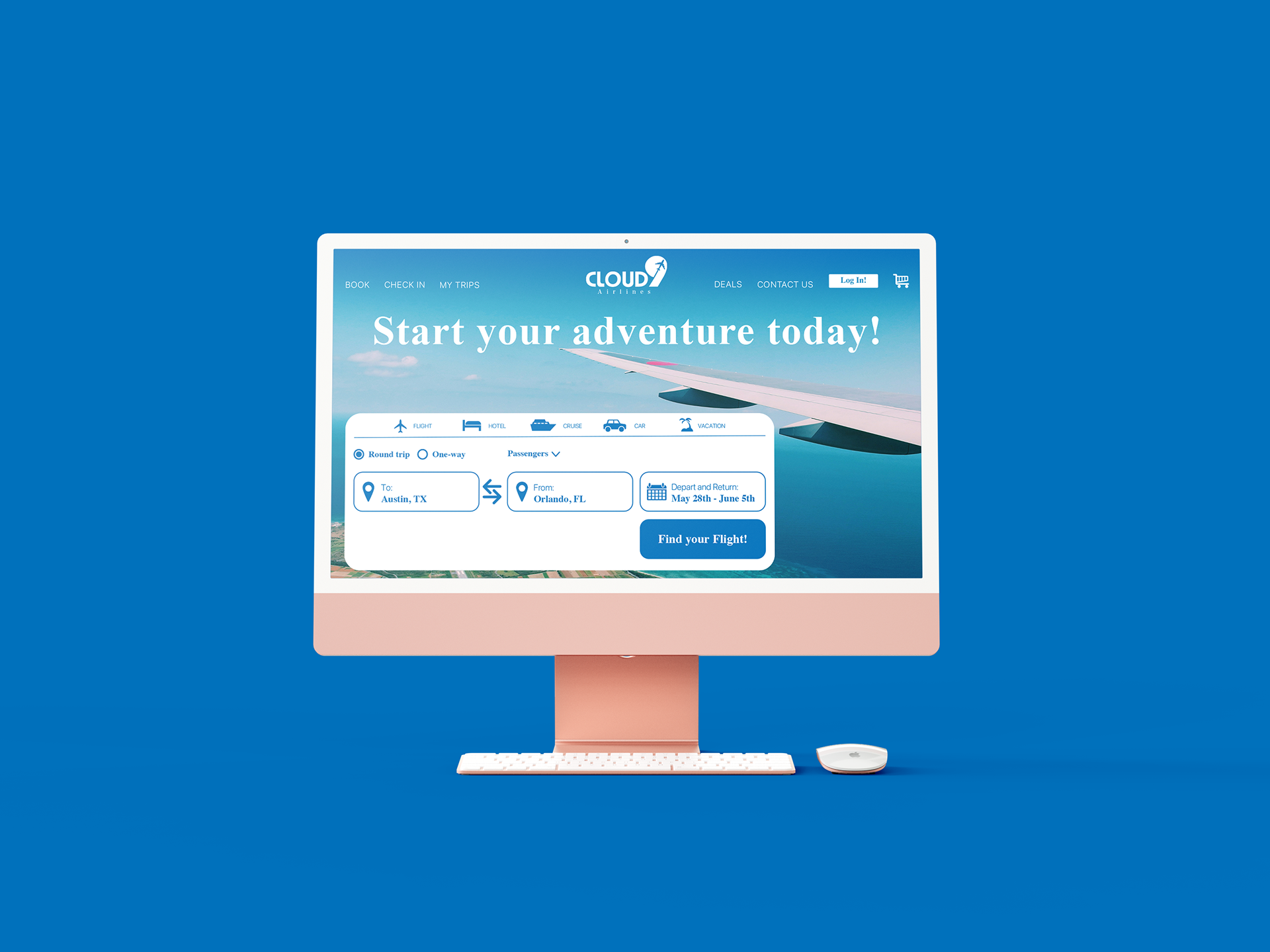
Website mockup.
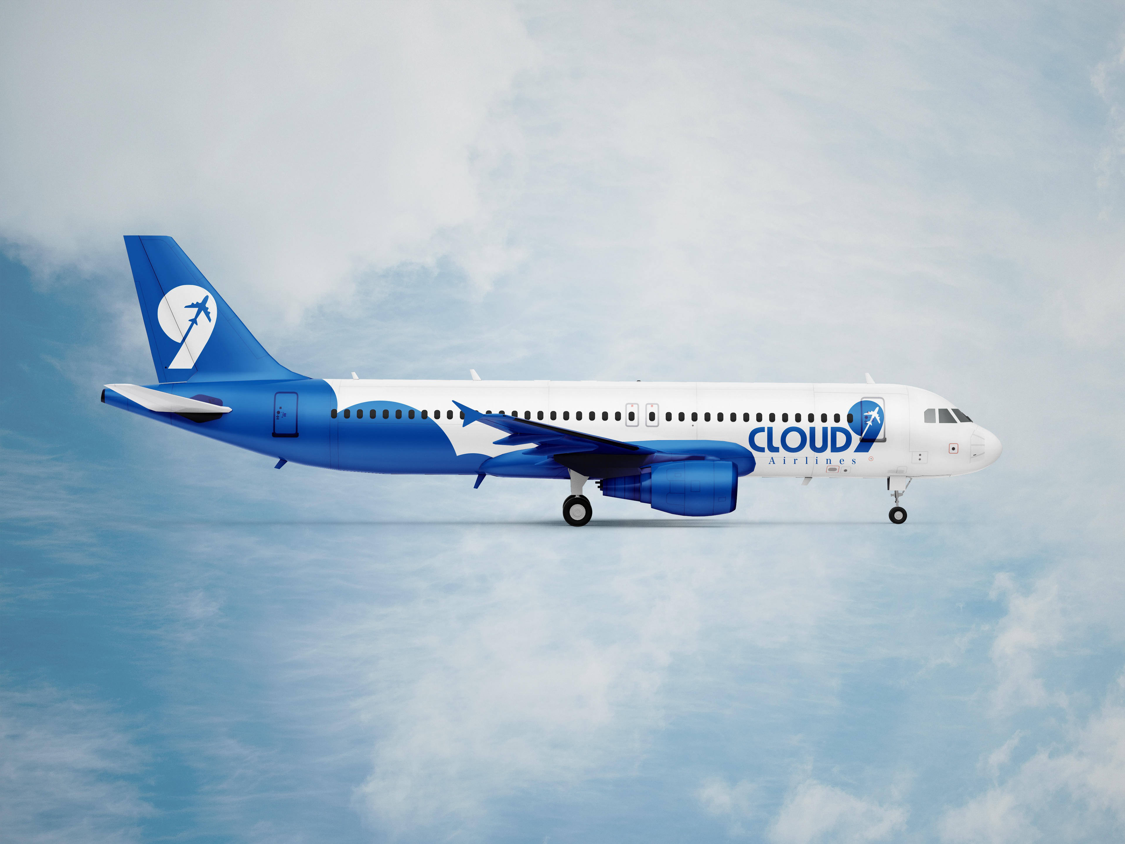
Plane paint-job mockup (side).
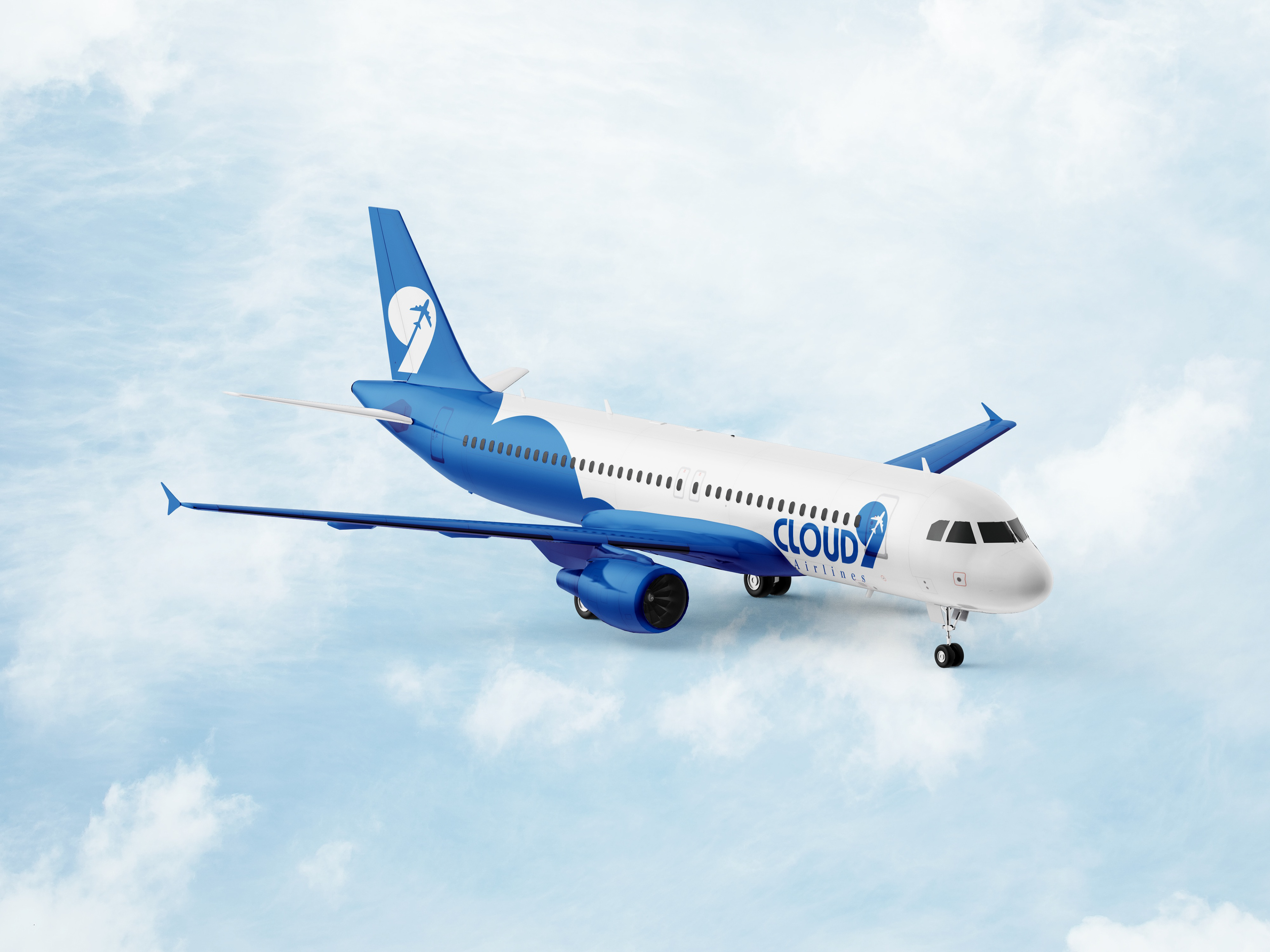
Plane paint-job mockup (angled).
Process (logo)
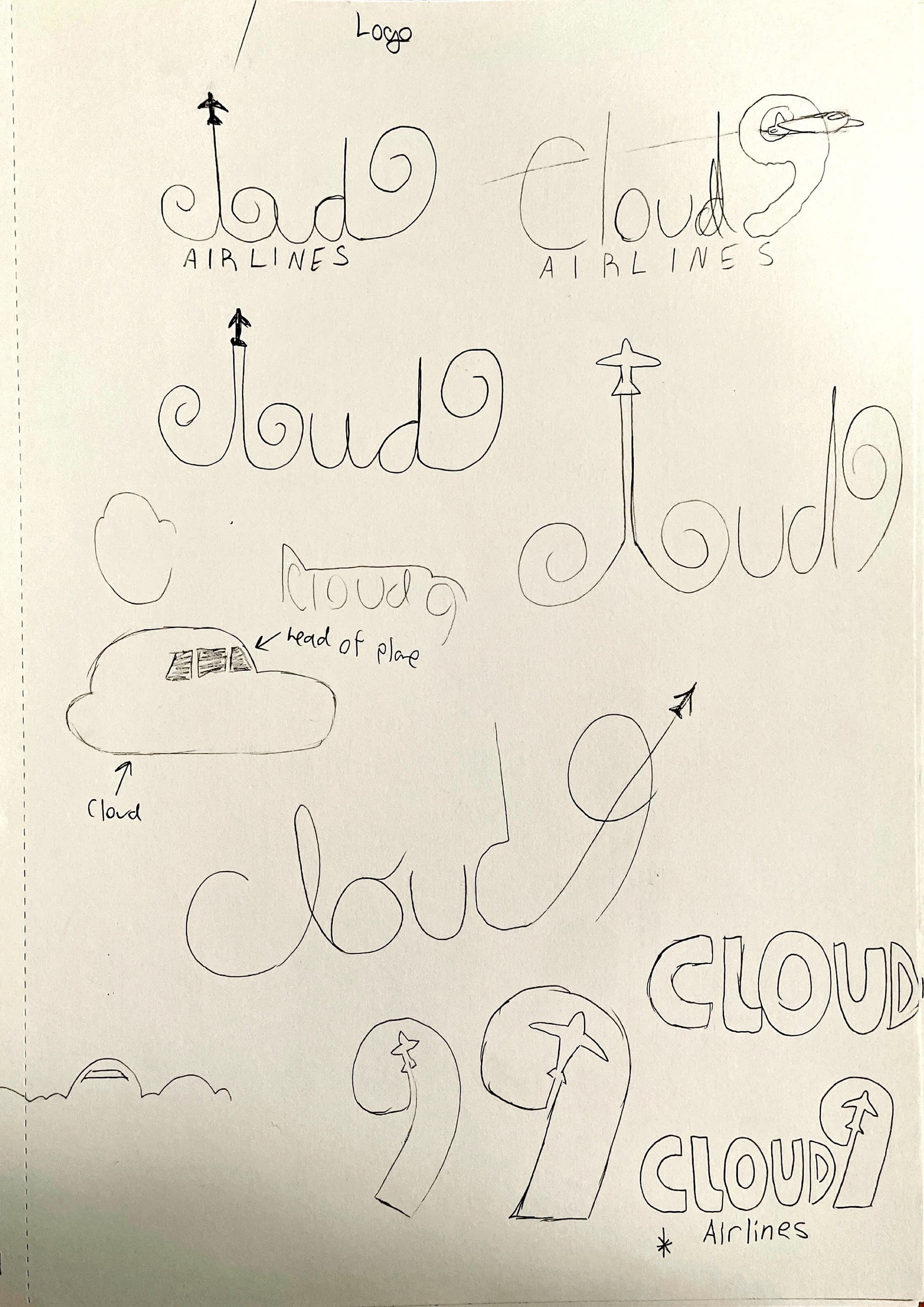
Other logo prototypes and final design. I tried more classic designs such as the plane making a hole to form the 9, as well as the head of the plane forming a cloud. They too didn't work out until I figured that having the plane form negative space in the center of the 9 would work perfectly. I used Atari's font for the base of the logo and rounded the edges. This made the logo more bouncy and more cloud-like.
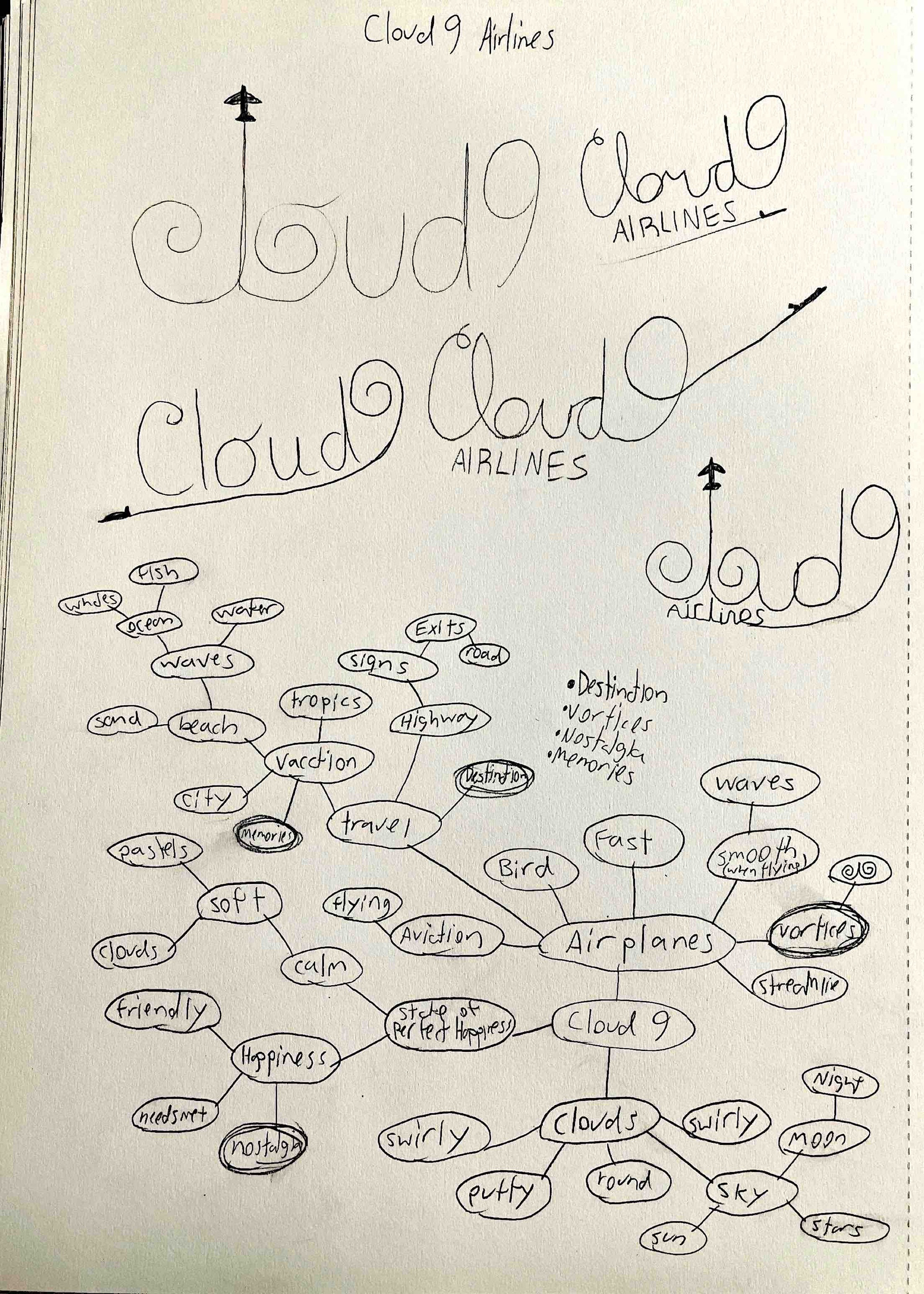
Word web and older logo versions. I experimented with using cloud vortexes to fill in the c, l, and o of Cloud9, but it didn't work out as I planned.
The logo was the most challenging due to Cloud9's branding and what they represent. I experimented a lot with vortexes due to their relation with clouds and how they created the c, l, and o of the logo so nicely. It ended up not working out as I planned. I tried more classic approaches such ad the plane being shaped like a cloud and the plane shooting through the 9. I felt that these were too cliche and boring. I decided to go with the 'plane-going-through-the-9' approach instead. It gave the logo a nice shape, made the plane look like it was going through a white cloud, and was easy to take apart and manipulate.
